- Home
- Craft Photography
- Photography Composition Tips for Beginners
Photography Composition Tips for Beginners
These photography composition tips for beginners show you simple techniques you can use to instantly improve your DIY product photography.
Beautiful product photography might look casual or unarranged, but there is plenty of thought put into even the most spontaneous looking photo.
There are several composition rules and design elements you can apply to your craft photography. You don't have to learn all of them to get started. We're going to stick with a few simple tips beginners can easily apply to get better results right away.
We'll look at two composition rules and six design elements you can use to make your product photos more captivating and effective.
Here's what we'll cover.
Photography Composition Tips for Beginners
- Rule of Thirds
- Golden Triangle
Photography Design Elements for Beginners
- Line
- Color
- Shape
- Light
- Texture
- Negative Space
Photography Composition tips for Beginners
Throughout the craft photography series, I've followed the theme, keep it simple. Just learn and master the basics. You can always expand on those basics later if you like.
In keeping with that theme, we'll limit our discussion of composition to two composition rules that are simple to implement and can have a big impact on the quality of your photos:
- the rule of thirds
- and the golden triangle
What is Composition in Photography?
Composition in photography simply refers to the arrangement of the items you see in the image. Good composition helps create a compelling photo that draws attention to the desired focal point.
You're thinking about composition when you ask yourself questions such as:
- Does the focus of attention appear in the middle of the photo? Or off to one side? Or toward the top or bottom of the image?
- Are there lines or curves created in the image? Where do those lines occur in the image? Where do they direct your attention?
Composition rules aren't limited to photography. You'll find these rules applied in all kinds of art. If you're a painter or an illustrator, or a film maker you'll know all about composition.
Rule of Thirds Photography Composition
The rule of thirds is probably the most well-known composition rule. It's easy to spot and easy to implement in your own photos.
If you're a beginner photographer, and you've never learned about composition, your first instinct will be to center the main subject in the middle of your photo. The rule of thirds tells you this is often a bad idea!
When you use the rule of thirds to guide the composition of your photo, you'll put the focal point (your product) off to one side, or toward the top or bottom of the image.
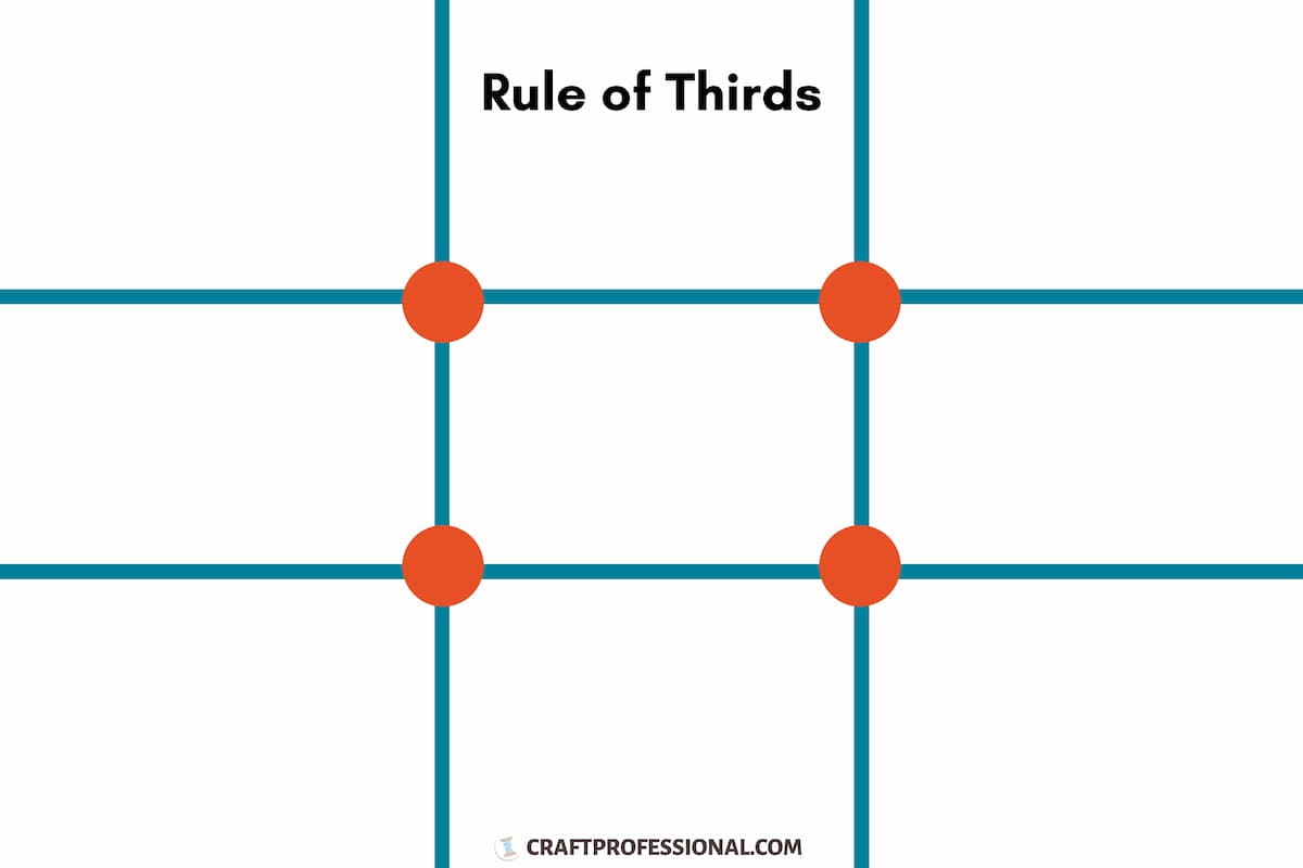
As you arrange and frame your photo, imagine the image divided into a nine-part grid. The focal point needs to fall at one of the intersections of the lines on the grid as shown in orange on the diagram below.
 Product photography composition - Rule of Thirds
Golden Triangle Photography Composition
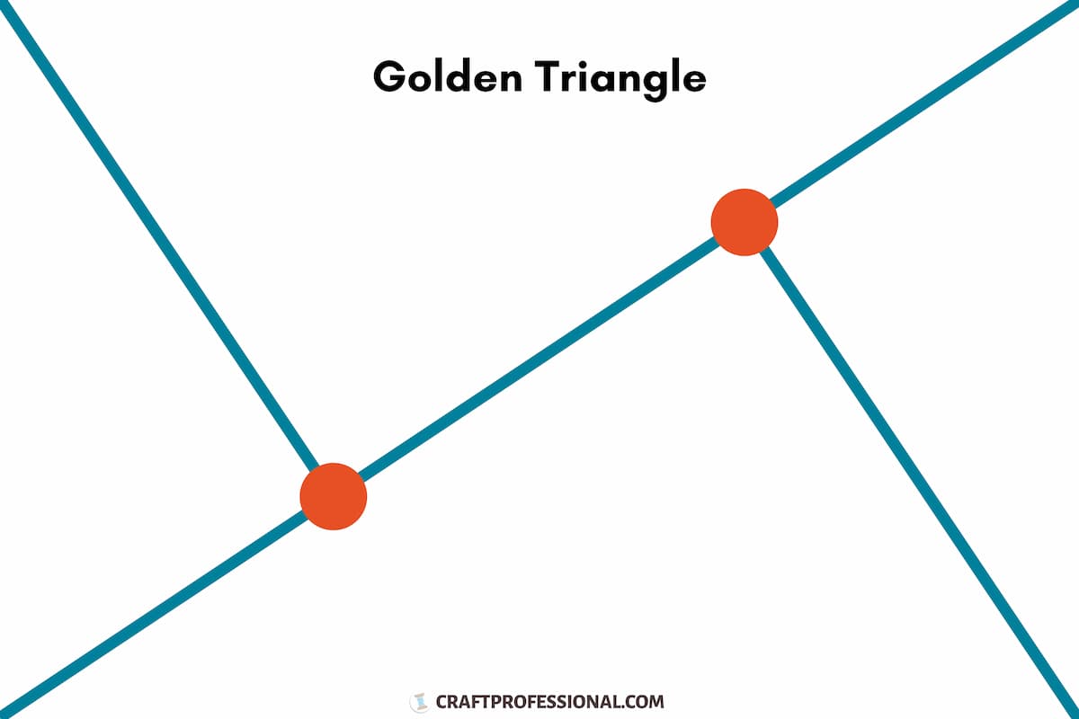
If you use the golden triangle rule to guide your photography composition, you'll imagine that your photo is divided into triangular sections, as you can see in the diagram below.
 Product photography composition - Golden Triangle
The focal point will appear at the intersection of the lines, shown as orange circles in the diagram above. The composition of the image will include a strong diagonal element with a leading line directed toward the focal point.
Golden triangle composition can be a bit tougher to grasp than the rule of thirds. If you're not completely sure about how to use the golden triangle, focus on using the rule of thirds in your product photography.
Spend time looking at product photography ideas you love, and think about the composition. Look for examples of the golden triangle to help get a better feel for how you might use it in your own photos.
Golden Triangle Composition Example
This image by Suin Photography shows the use of the golden triangle. The grid over the image will help you see the points on the triangle. Notice how the placement of items in the image zigzag to create diagonal movement.
Keep the Final Image Size and Use in Mind
Remember to keep the final size in mind as you compose your photo. For example, we know square photos are best for Instagram, and tall rectangles are better for Pinterest. You'll need to make sure your beautiful composition still holds its appeal if you need to crop your photo for your intended use.
You can test the composition with your smartphone's camera.
It's simple to change aspect ratio (the dimensions of a photo) on a smartphone's camera.
If you're using a DSLR camera to photograph rectangular images that will need to be cropped square, take a couple of square test photos with your smartphone first. You may be able to get better photos with your DSLR camera, but the square test photos you take with your smartphone will help you see how your composition will translate in the final cropped image.
Photography Design Elements for Beginners
When you create your handmade products, you probably make use of design elements such as:
- line
- color
- shape
- light
- texture
- negative space
All of those elements can also be used to make your craft photography more compelling. They can elicit an emotional response that helps you connect with your target customer and build desire to purchase.
Line
Lines in photos can be created by any number of things. For example, a stone path, wood planks, fence rails can all create lines that will have a big impact on the overall look of a photo.
Leading lines draw your eye in a specific direction, ideally to the focal point, your product. Be aware of this effect and think about where any lines are leading the eye as you compose your photos.
Lines can also create different moods depending on the direction. If you're using lines as a design element in your product photos, experiment with horizontal, vertical, and diagonal placement of the lines to see what works best for you.
Photography Life has some great examples of leading lines used to create interest and draw the eye into photos.
Color
Color can be an effective tool to draw attention where you want it in your photos. Imagine a small pop of color that contrasts with the rest of the image.
Color can draw you in, create a mood, tell a story about your brand, and create consistency across your photos.
Shape
Shapes can be reflected in the item itself, in any product photography styling props you use, or in the overall arrangement of those items.
In design, shapes are generally divided into two categories: geometric and organic.
The shapes you create as you arrange your subject to photograph will impact the feel of your photos. Geometric shapes in your photos typically create a more structured and ordered appearance. Organic shapes appear more loose and natural.
Light
Light has a huge impact on product photography. Subtle changes in light and shadow will have a big impact on the mood your image portrays as well as the amount of detail that's visible.
Don't cut corners when it comes to learning about how to light product photography. This is one area that deserves your time and full attention if you're going to take your own product photos.
Texture
Texture, particularly contrasting textures, can add richness to your images, evoke the sense of touch, and elicit an emotional response.
For example:
Using a wood product photography background surface to photograph your handmade tableware can evoke feelings of happy times sitting around the dining room table with family.
Styling your handmade rocking chair with a knit blanket can help customers imagine feeling cosy and relaxed.
As people view these images, they can imagine the feel of the wood table or the knit blanket. Those sensory inputs help to draw people into the story you want to tell about your product.
Negative Space
Negative space is the space in your image that's not filled. You may see a fairly plain surface or background in the negative space, but there's no real detail in this area.
When composing your photos, the space you choose to leave blank can be just as important as the space where you do place items. Negative space can help lead the eye to draw focus to the product.
You may want to consider including negative space in some of your product photos to leave room to add text to your images for use on your website or social media posts.
Experiment with Photography Composition and Design Elements
Look for the use of composition and design elements in product photos online, and think about what might work for your brand.
Experiment with those concepts in your own product photos. Arrange your subject to explore composition rules including the rule of thirds and the golden triangle. Try out different ways to use design elements such as line, color, shape, light, texture and negative space in your photos.
It will take some time to find a look you love. Once you do find the right combination of composition and design elements for your brand, they can be incorporated into a photography style guide which you can use to create a cohesive look across all of your product photos.


New! Comments
Have your say about what you just read! Leave me a comment in the box below.