Visual Merchandising Strategies for Your Craft Booth
There are plenty of visual merchandising techniques that have been tested by retailers and proven to increase sales and profits. Surprisingly, people who sell at craft shows, even those who sell at very competitive shows, often don't make use of those techniques in their booth and display design.
Happily, many of the visual merchandising techniques that work for retailers can be easily translated to use in a smaller and portable craft booth space. In fact, you may find you can implement many of these display strategies for free, or very inexpensively. Often, it's simply a matter of making changes to the way you arrange your products on your existing display furniture.
So, if the techniques are largely inexpensive to implement, and they work for other retailers, why not give them a try in your own craft booth?
Visual Merchandising Strategies For Craft Show Displays
Below, we're going to look at how craft artists can create an effective craft booth that's designed to boost sales and profits at craft shows using:
- strategic display design
- clever color
- and smart signs and posters
Strategic Display Design
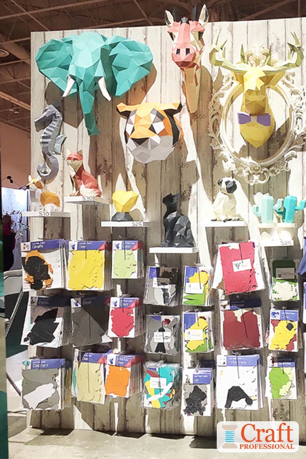
This booth features a unique product that shoppers may not have encountered before.
The craft artist sells kits, similar to 3D puzzles, that contain precut shapes that the customer can fold and assemble to create the adorable animal heads displayed at the top of the booth.
The finished product is not for sale, just the kits.
If this artist only displayed the kits without showing the finished product, shoppers would have absolutely no idea what was being sold.
When your product is unique, and it's use is not immediately obvious, you need to make it obvious in your display. This display does a great job of accomplishing that task.
The finished product displayed at the top of the space can be seen from a distance. The animal heads are striking and sure to draw attention and interest. Once customers are drawn into the booth, they can easily shop for kits that are neatly arranged immediately under the finished product.
I earn a commission for purchases made through links on this page.
To learn more, please see my disclosure.
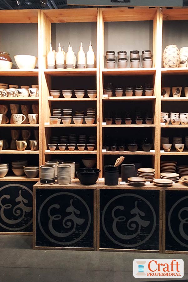
The boards that divide this shelf system vertically help this potter to display products more effectively.
It's wise to create a bit of space between different products. The space makes it easier for shoppers to see at a glance all of the different products available. In this pottery booth, that space is created by the vertical wooden boards that form the frame of the shelves.
You don't need a physical divider to create space between your products. Simply leave an inch or two of open space between different product lines.
You can see an illustrated example showing how to leave gaps between product lines here.
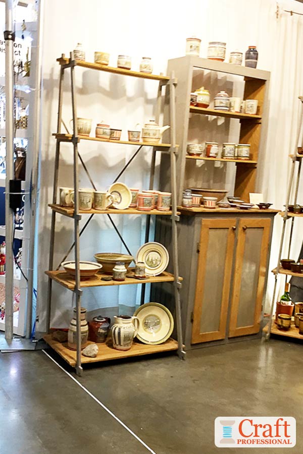
Here's a shelf display that's very shoppable because it's not over crowded.
There's enough product displayed to fill the shelves, but they aren't too full. There is enough space between products that customers can easily pick up an item to take a closer look.
Displaying tableware on a sideboard, like the one shown on the right of this photo helps customers to imagine those products in their own home. Of course, large and heavy display furniture isn't always practical for smaller shows. If you're selling at smaller, single day shows, try to brainstorm a more portable way to display your products as they would be used.
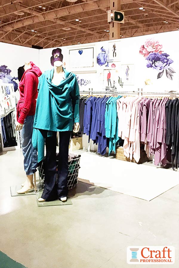
If shoppers can approach your booth from more than one direction, it's important to ensure your displays look good from all sides that a shopper might come from.
The clothing display shown here can be approached from the left or the right, and the designer has kept that in mind in the way she positioned her mannequins. One is facing customers that will approach from the left, and the other is angled for customers approaching from the right.
Clever Color
Tony Morgan, author of Visual Merchandising, says "Color really is the most magnificent tool for capturing the attention of passersby and creating atmosphere."
It's a powerful visual merchandising tool, and using it well can cost you as little as a can of paint.
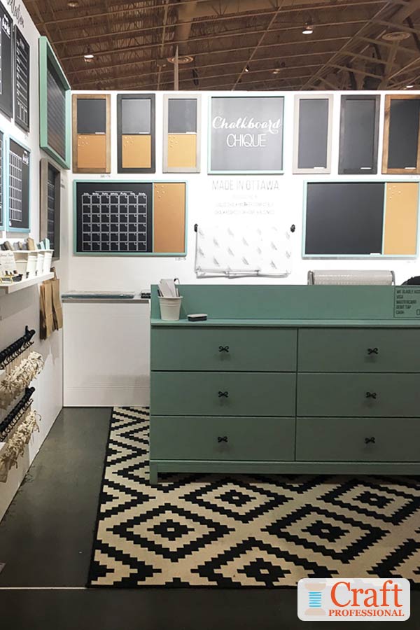
One way to use color effectively is to limit yourself to a palette of no more than three colors.
Of course, that strategy may not be for you if you create products in a riot of colours. But if your products all fit within a simple color scheme, like the chalkboard calendars pictured here, be sure to carry that color scheme throughout your display.
The green against neutral blacks and browns create a beautiful, cohesive look in this booth.
Tony Morgan also says, "If in doubt, always go for the brighter or darker option."
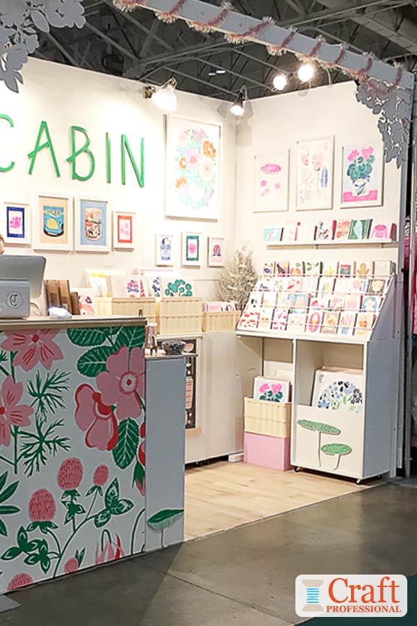
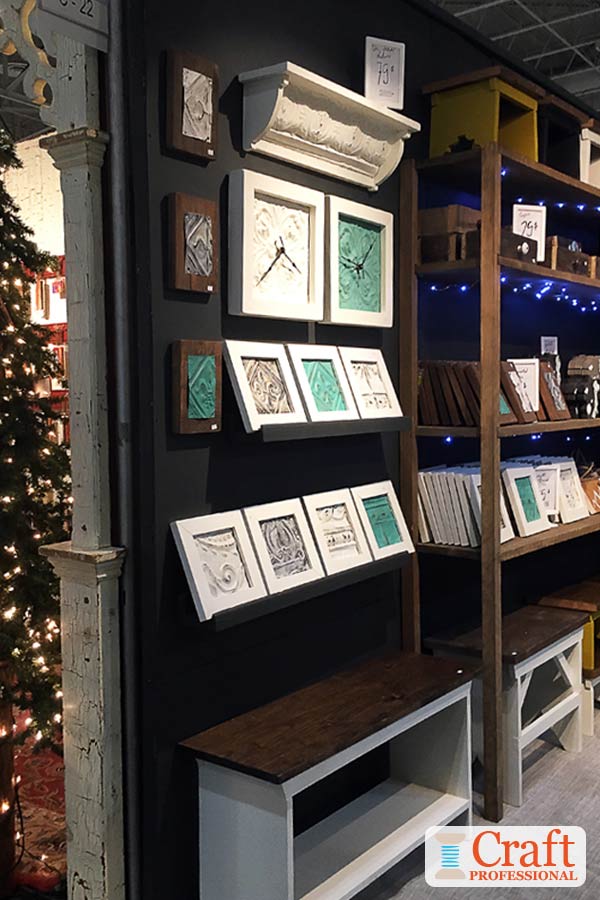
If you want to use color to make a statement in your craft booth, don't shy away from strong colors. You can see the effect of going very bright, or very dark in the two booths pictured below.
The first display shows a vivid pink, green, and white booth that's cheery and ready for spring. Although the booth feels quite bright and colorful, the artist has primarily limited herself to three colors.
The next display shows the drama you can create by going dark with your booth color. The white clocks clearly stand out against the black backdrop. This booth also has a limited color palette reflected in both the display and the products.
Smart Signs and Posters
Signs and posters are another smart way to make your display more effective.
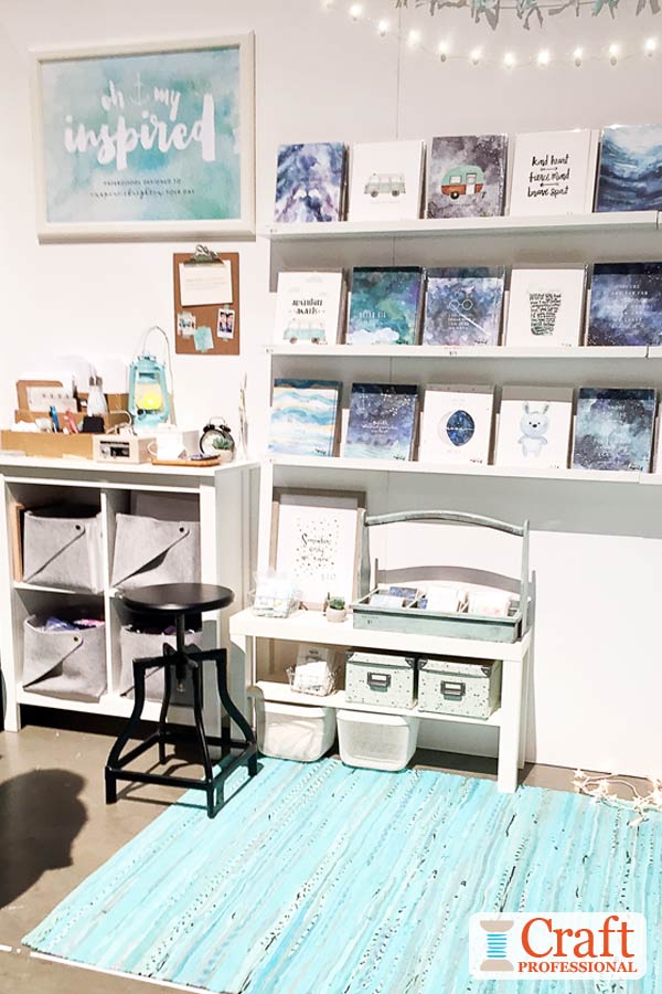
The sign visible at the top left of this booth photo shows off this artist's style.
Her watercolor cards and art prints are smaller in scale, so the larger sign helps to show her style from a distance.
I almost included this booth photo in the section on using color effectively. The palette of blues, right down to the rug on the floor, against neutral white and brown creates a pretty, cohesive look.
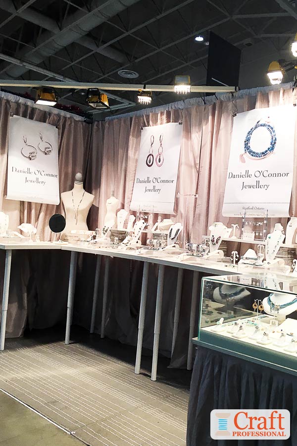
Here's a jewelry designer who is using large scale product photos to great effect.
The challenge inherent in displaying jewelry at craft shows is how to grab attention and entice shoppers into your booth when your product is tiny and only really appreciated up close.
Large-scale product photos solve that problem. In fact, it's my opinion that anyone who sells small items, like jewelry, should seriously consider adding some large posters that feature excellent, professional product shots of your most impactful pieces.
These posters make good use of the upper half of this display space. Hanging posters high makes them more visible from a distance.
Those who are aware of the effectiveness of repetition in odd numbers in displays will appreciate the use of three posters in this display.
Use Visual Merchandising Techniques in Your Own Craft Booth
If you're wondering why you've never heard about visual merchandising for craft show displays, and you're excited to try some of these strategies in your own booth, here are a few more resources to help you get started.
Visual Merchandising by Tony Morgan: This book is a fabulous resource for anyone who wants to really dig into the topic. Its focus is merchandising for shops that you'd see downtown or at the mall, but there is plenty of advice that translates perfectly well for use in portable craft displays.
Visual Merchandising Course For Retailers and Students:
This Udemy course taught by professional visual merchandising specialist, Sarah Manning, is full of affordable, actionable strategies you can use to create a more effective craft show display. The course was created for traditional retailers, but the vast majority of advice can be used equally well in your 10x10 craft booth space.
Visual Merchandising Tips: Here's how six key display principles - symmetrical pyramids, asymmetrical pyramids, repetition with odd numbers, alternation, elevation to eye level, and gaps between product lines - can help you sell more of your most profitable products.
Visual Merchandising Techniques: Six merchandising techniques perfected by retailers and ready for you to use in your craft display.


New! Comments
Have your say about what you just read! Leave me a comment in the box below.