10 Handmade Soap Display Photos
A good handmade soap display lets customers get close, touch and smell. It's not too fussy and encourages touching the product.
A layout that encourages good flow through the booth and makes best use of the space is essential. Customers need to feel comfortable lingering to find their favorite scent, or discover the soap that has just the right texture or ingredients.
Plus, since soaps are smaller products, you'll need to consider how you'll draw customers in and communicate what your product is about from a distance.
Check out these 10 photos of soap booths that do all of that beautifully!
Some Terrific Handmade Soap Displays
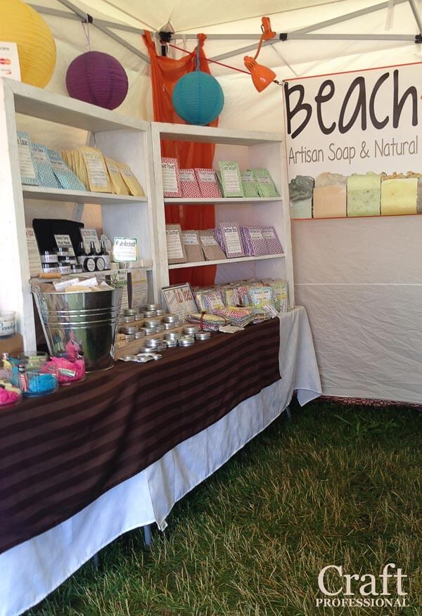
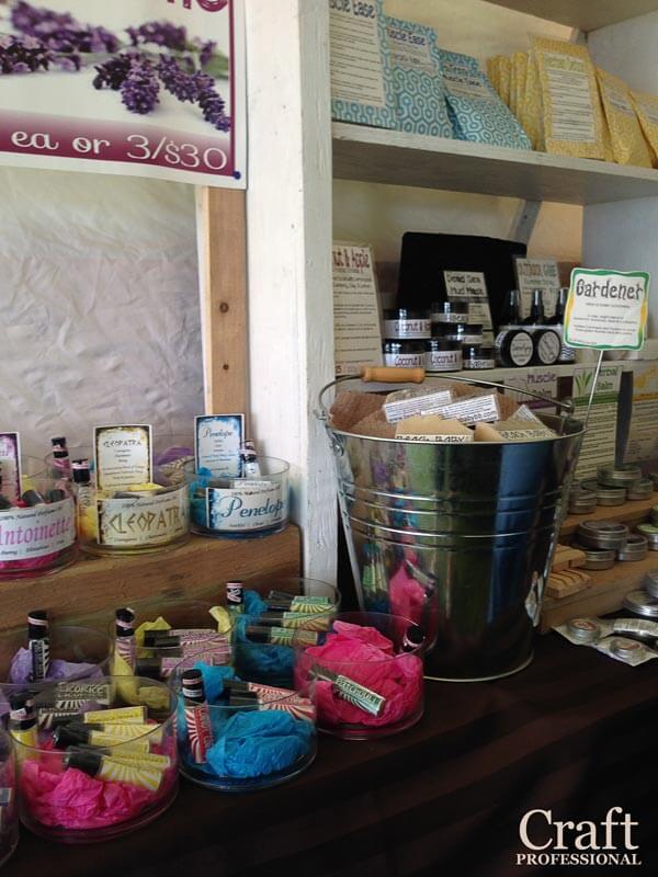
The two photos below show different angles of the same booth. Pretty colored packaging, color blocking, plus a few bright accessories make an impact in this booth. Shelves and risers make good use of the full height of the booth, and the tables aren't too wide, so they don't block the flow of traffic into the booth.
The close up photo on the right show how beautifully the colors work in the booth. A beach theme is perfect for a summer craft show.
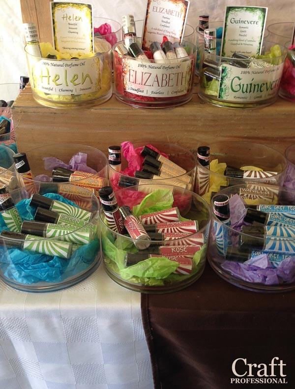
Pretty tubes of lip balm (from the same booth pictured above) are held in clear bowls.
Don't worry if you don't have enough product to fill your container. Simply use coordinating tissue paper to fill out the space as you see pictured here.
The next two photos feature a casual soap booth with stacks of loaves of soap.
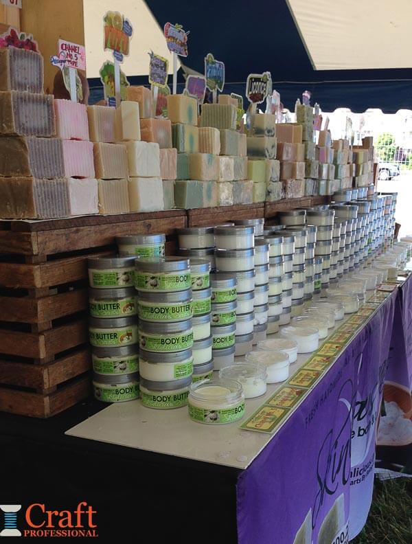
Rows and rows of stacked, gorgeous handmade soaps invite customers to smell until they find a favorite.
There's plenty of room to browse this booth. You can start at one end and work your way down easily.
The colorful signs sticking out from the soaps tell you the soaps' names. Some names are perfectly descriptive, and others are a bit fun and whimsical, piquing your curiosity and encouraging you to smell the soap.
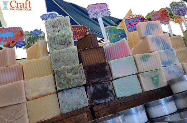
Once you find your favorites, the soap maker will cut a fresh slice for you.
Everything is displayed at the ideal space between waist and eye-level.
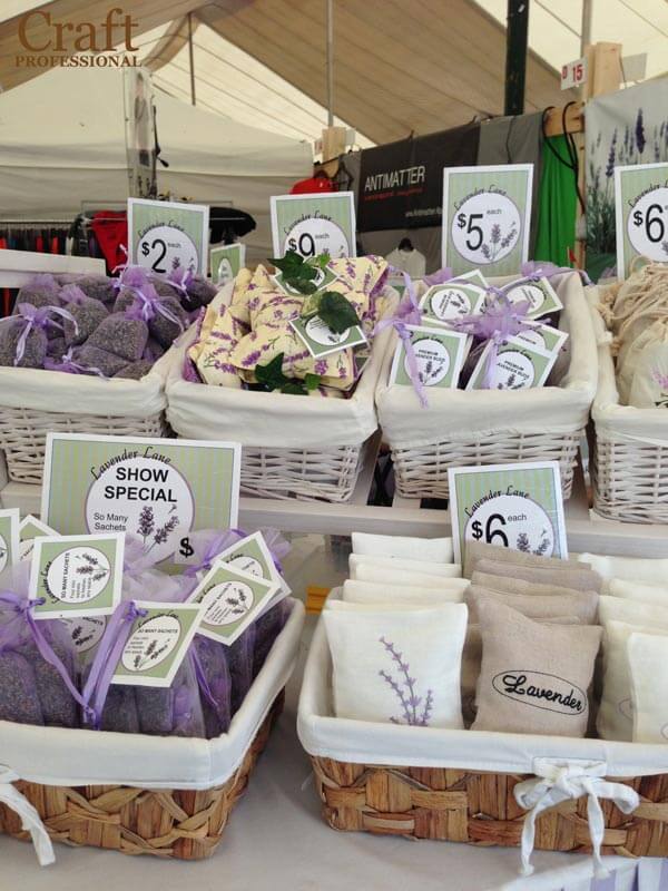
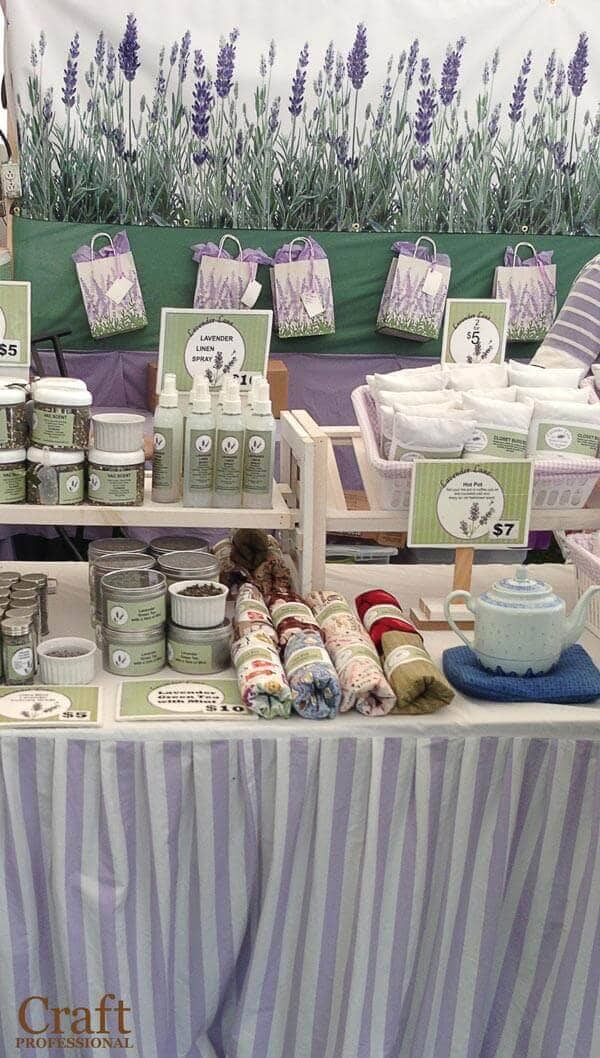
The next two photos show lovely lavender dressed up in pretty, feminine packaging. If I'm buying lavender, I want to relax and feel a bit pampered. This booth, with its sweet, feminine packaging, communicates all of that.
The products placed in baskets aren't too carefully arranged. Super-fancy arrangements discourage touch. You want to go for tidy, but not fussy.
The photo on the right show a beautiful large-scale backdrop of lavender. It makes the booth look great, draws attention from a distance, and tells customers immediately what to expect.
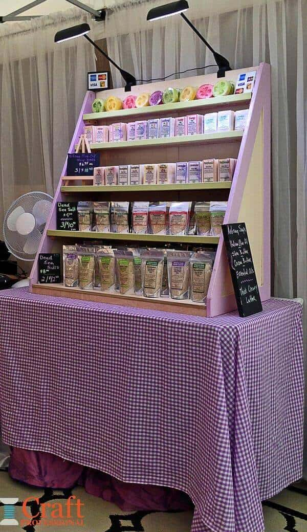
Here's a display that's part of a larger booth. The shelf on the table makes good use of height, and the lighting helps to add interest to the booth as well. A pretty purple and white color scheme looks fresh and ties the display together.
Notice the fan just peeking out on the left of the photo. It illustrates a more practical element of booth design. You put a lot of effort into making your customers comfortable, but don't forget to make sure you are comfortable in your booth as well.
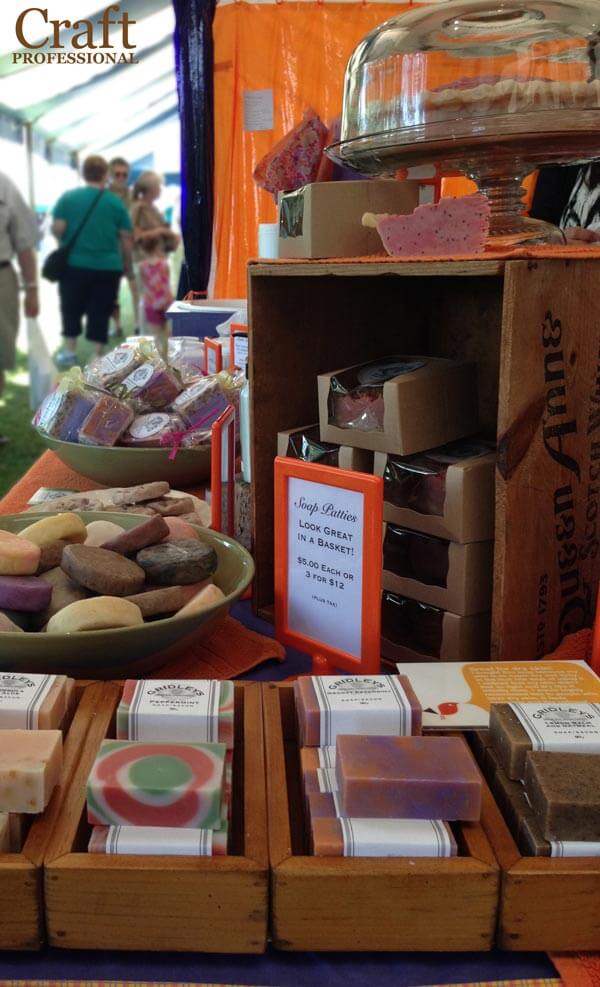
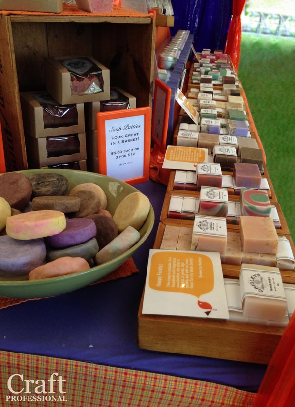
I wish I had a wider shot of this beautiful display of handmade soap. Michele of Gridley's Herbs and Aromatherapy created this spectacular booth with a vivid orange and purple color scheme that really draws you in.
On the right, you can see the same booth from a different angle. Rows of soaps are all easy to access, so customers can explore and find the perfect scent.


New! Comments
Have your say about what you just read! Leave me a comment in the box below.