- Home
- 1000+ Craft Booth Photos
- Pop Up Shop Display Ideas
8 Pop Up Shop Display Ideas to Design a Vendor Booth People Will Love
8 pop up shop display ideas and 11 photos show you how to use creative visual merchandising to design a vendor booth that stands out.
The way you set up your booth plays a vital role in a successful show.
An unremarkable display can cause shoppers to walk by your space without a second glance. A great display can draw in shoppers from up close or at a distance and show people why they need to buy your product.
Luckily, there are several visual merchandising techniques you can use to design a great display. These techniques have been tested by many retailers. They work, and they are easy and inexpensive to use.
8 Pop Up Shop Display Ideas
We'll look at 8 merchandising techniques and 11 booth photos to see how vendors use simple strategies to design great displays.
The examples show how to display jewelry, clothing, and other handmade items. You'll see pop up shops using tables, portable shelves, and pegboard.
We'll focus on one merchandising technique in each example, but many of the examples use several techniques. You don't have to use every visual merchandising strategy in your booth. But a smart combination of a few of these pop up shop display ideas will result in a stand out design.
8 ways to make your pop up shop stand out:
- Display less to create a high-end boutique look
- Elevate items to eye level
- Be purposeful with color
- Add plenty of light
- Use repetition with odd numbers
- Create a lifestyle display
- Create a fitting room for a clothing pop up shop
- Avoid over-crowding your merchandise
1. Display less to create a high-end boutique look
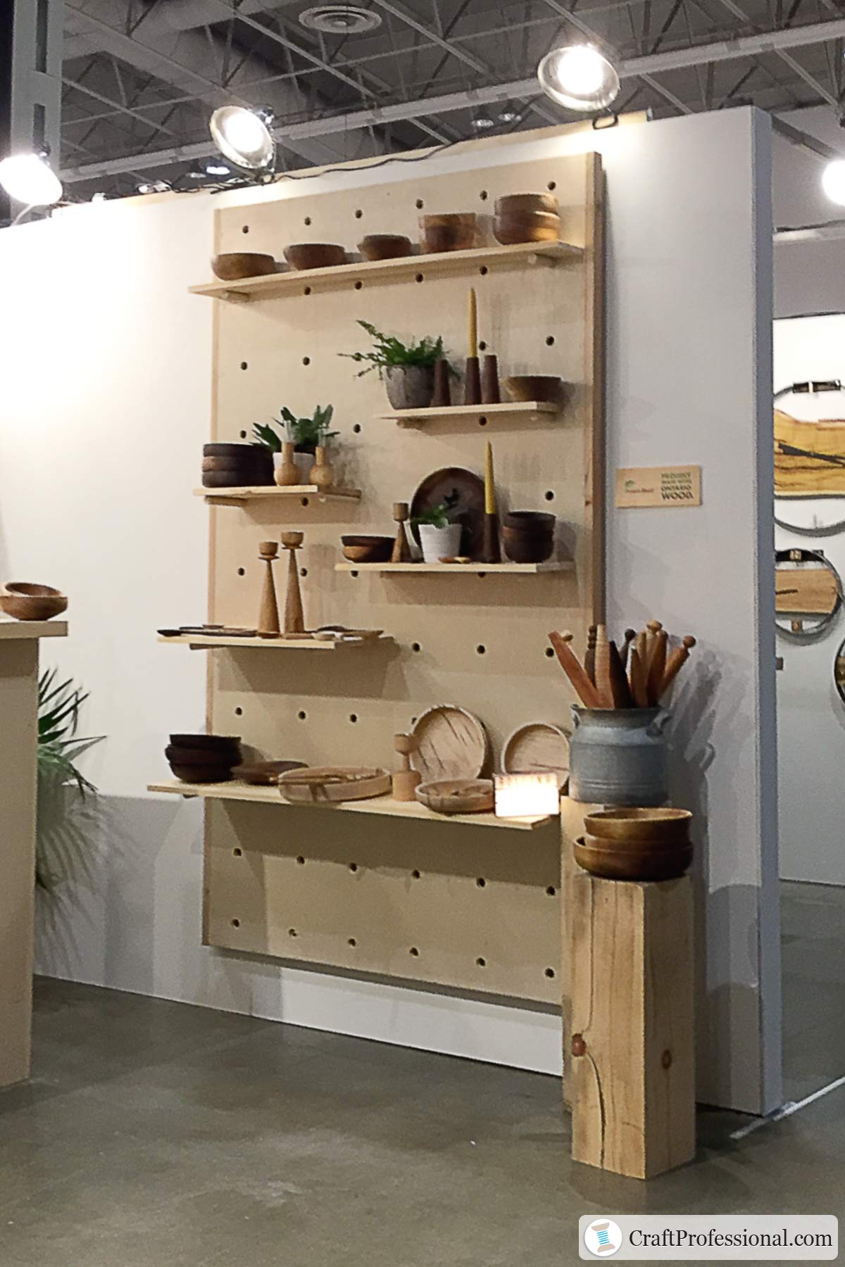
To create the look of an upscale boutique, display less product and keep your space uncluttered.
Generally, shoppers expect they will pay less when there is a lot of product on display. When you display fewer items, each item appears more rare and special to customers. This merchandising strategy can help you raise the perceived value of your products, and you may be able to command higher prices.
The booth pictured above uses simple wood pegboard displays and pedestals that blend with the products in the space.
Pegboards allow you to make excellent use of eye-level space in your booth. Display pedestals can be placed almost anywhere, so they give you flexibility to set up your booth in a variety of configurations.
The arrangement of products is uncluttered, and shelves are set up in a zigzag pattern to help draw the eye around the space. A few plants add interest and help shoppers imagine these treasures in their own homes.
2. Elevate items to eye level
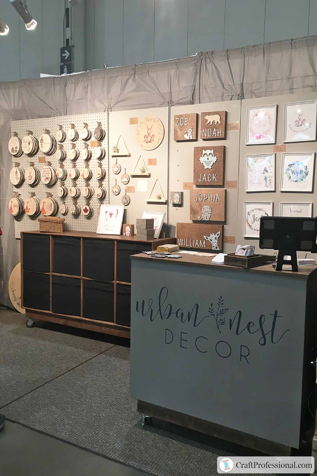
The booth pictured above features a pegboard display. It makes excellent use of the vertical space in the booth with products displayed at eye level.
Peg board also provides flexibility to use any combination of hooks or shelves, which you can arrange in a variety of ways. You can experiment until you get the look you want.
Products displayed at eye level tend to sell better. In fact, some visual merchandising experts like to say, "Eye level is buy level." That's why smart retailers place their most profitable products at eye level.
Customers standing in your booth will see products displayed at eye level first. They may completely miss anything that's displayed lower or higher. Items placed at eye level will also be more visible from a distance, which can help attract passing shoppers into your booth space.
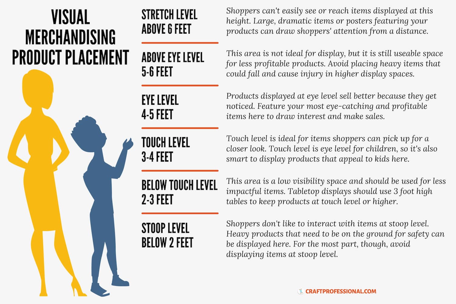
What is eye level in merchandising?
If your customers are adults, eye level is approximately 4 to 5 feet off the ground. Products that appeal to children can be placed lower, at about 3 to 4 feet.
When you're designing your own pop up shop, look for ways to use vertical space effectively. On walls, pegboards and grid wall panels can help you make the most of valuable eye level display space.
On a tabletop display, your table should be about 36 inches high, which is perfect for encouraging shoppers to pick up and touch items on display. Portable shelves, risers, and stacked crates can elevate products of a product display table to eye level.
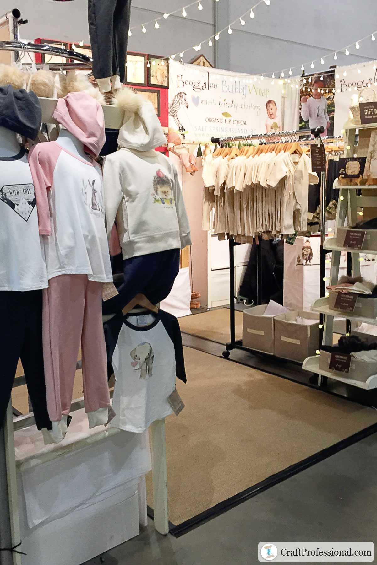
Here's another vendor booth with products displayed at eye level.
Three hanging mannequins are positioned at an adult's eye level and arranged at the entrance to this display.
Notice one shirt featuring an adorable elephant is displayed lower, at a child's eye level. This vendor sells handmade children's clothing, so the shirt that's lower will draw kids' attention. The other items placed at 4-5 feet will be seen by adults shopping for the kids in their lives.
The rule of three, displaying items in odd-numbered groups, is another effective visual merchandising trick. In this booth, three outfits are grouped together in the focal display. A group of two or four would not make the same impact.
3. Be purposeful with color
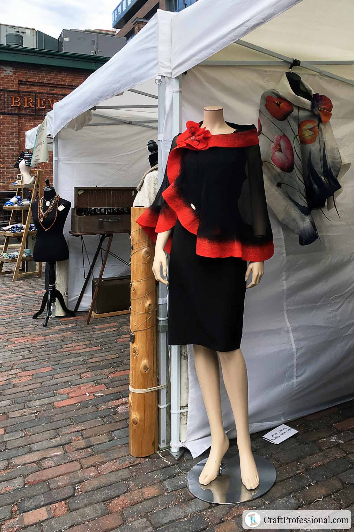
Color is a powerful retail merchandising tool, and this pop up shop makes effective use of striking color.
The mannequin dressed in a black dress with eye-catching red trim make a strong impression. Placed at an outside corner of the booth, it is perfectly positioned to attract the attention of people passing by.
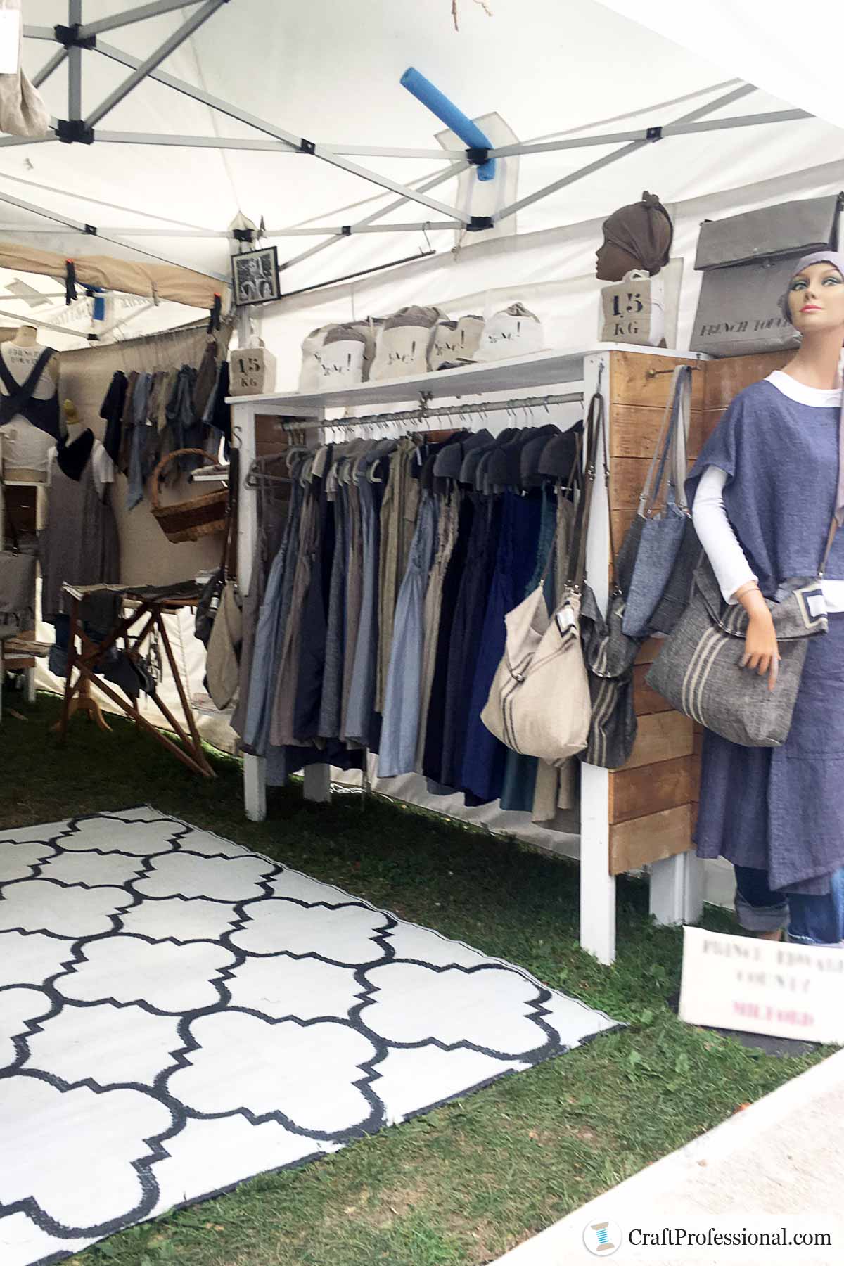
Here's another clothing display that uses color effectively.
In this example the color is more neutral and subtle. The range of colors is limited.
Limiting the color palette used in your most prominent displays to a maximum of three colors will help you create a cohesive and attractive look.
Why is a pool noodle lodged between the tent's frame and canopy?
You may have noticed the blue pool noodle placed between the tent frame and canopy and wondered why it's there.
This booth is at an outdoor craft show. The only thing worse than being at a rainy outdoor craft show is being at a rainy outdoor craft show with a leaky tent!
Some vendors use a pool noodle to prevent leaking caused by water pooling on the canopy. If you're selling at outdoor shows, here's where you can learn more about how to keep your portable canopy dry at rainy craft shows.
4. Add plenty of light
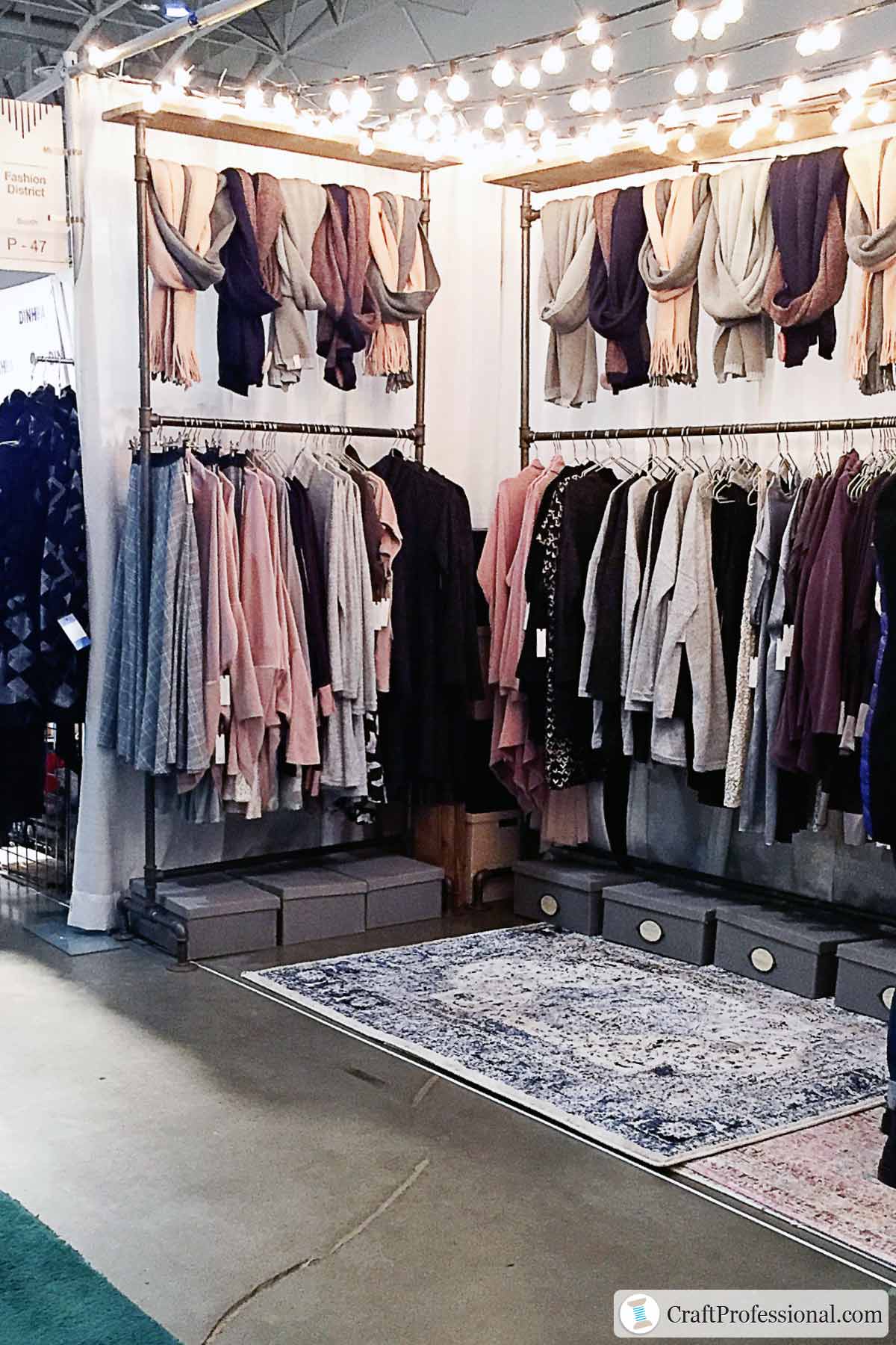
Your display isn't finished if you haven't accounted for booth lighting, particularly if you're selling at indoor shows.
Several smaller lights are always preferable to a single large light. One large light will not light up all corners of your display space.
Several overhead lights can be positioned throughout your space to ensure everything is well-lit.
5. Use repetition with odd numbers
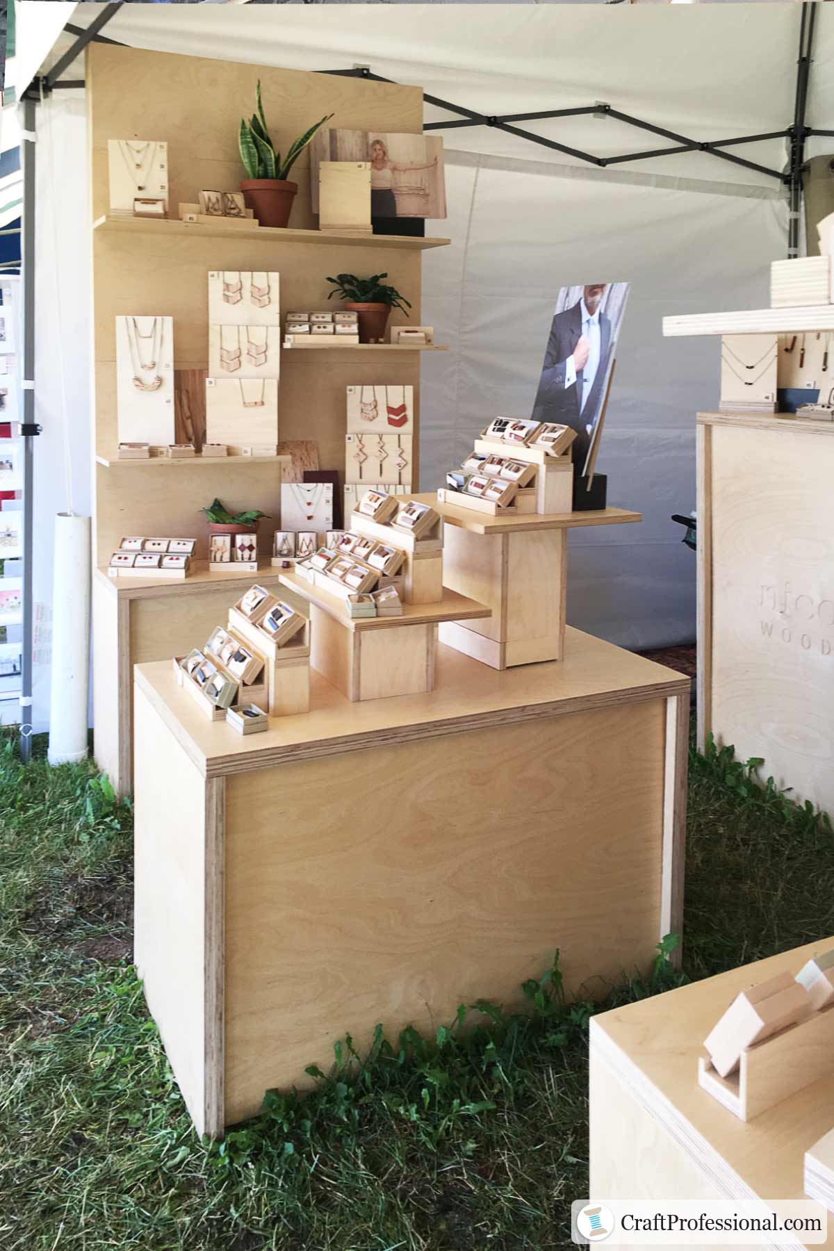
Repetition with odd numbers, also called the rule of three, is a simple way to create a display that stands out.
Simply group products together in odd numbers. Groupings of three or five will be more pleasing to the eye than two or four items grouped together.
The jewelry display pictured above uses this rule in several spots. Notice the necklaces displayed in groups of three or five.
This booth also makes excellent use of height with statement necklaces displayed at eye level, where they will have the biggest impact. Many of the smaller items are displayed lower, at touch level (about 3-4 feet). Shoppers can easily pick up these items for a closer look.
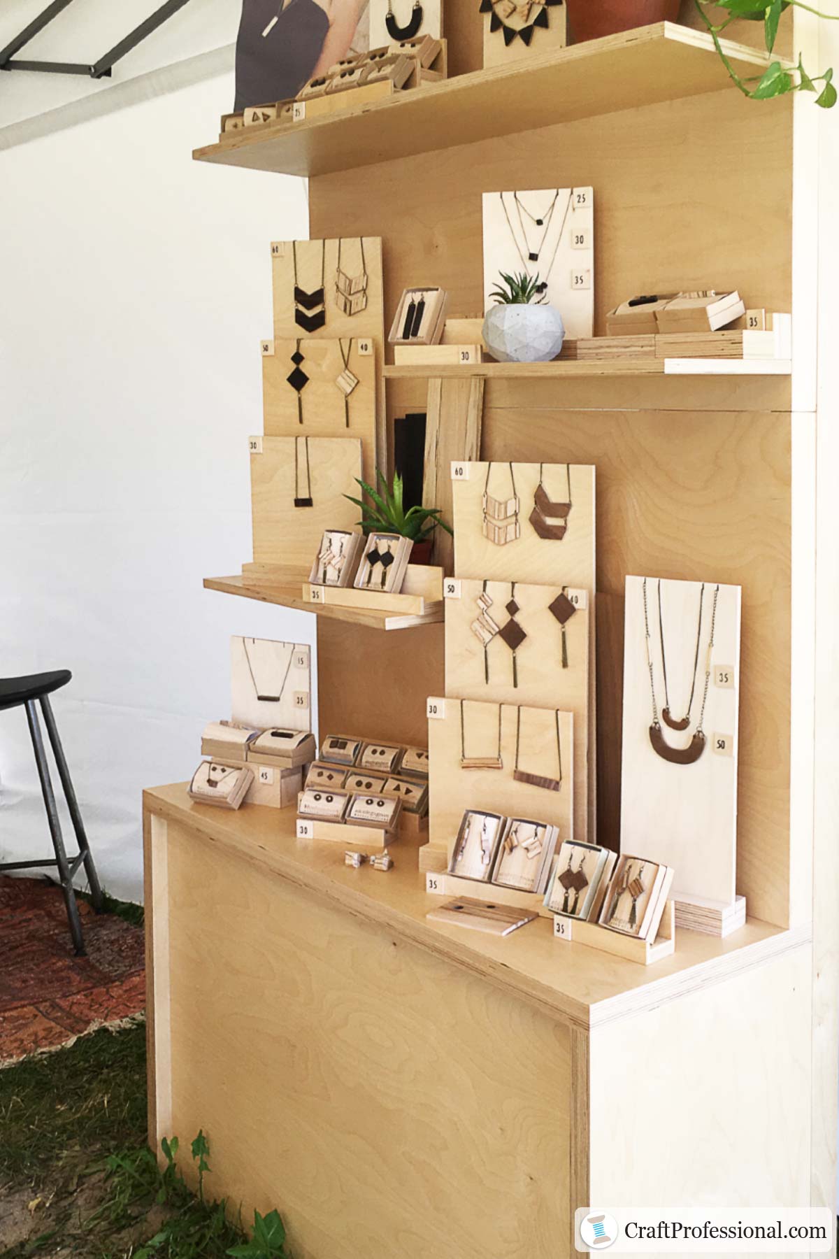
Here's the other side of the same jewelry booth.
Pendants here are also grouped, for the most part, in odd numbers on wood necklace easels. Dramatic statement necklaces are displayed at eye level. Smaller pairs of earrings are displayed at touch level.
Notice the way the necklace stands are used to vary height throughout the display creating a zigzag pattern that draws the eye through the space.
6. Create a lifestyle display
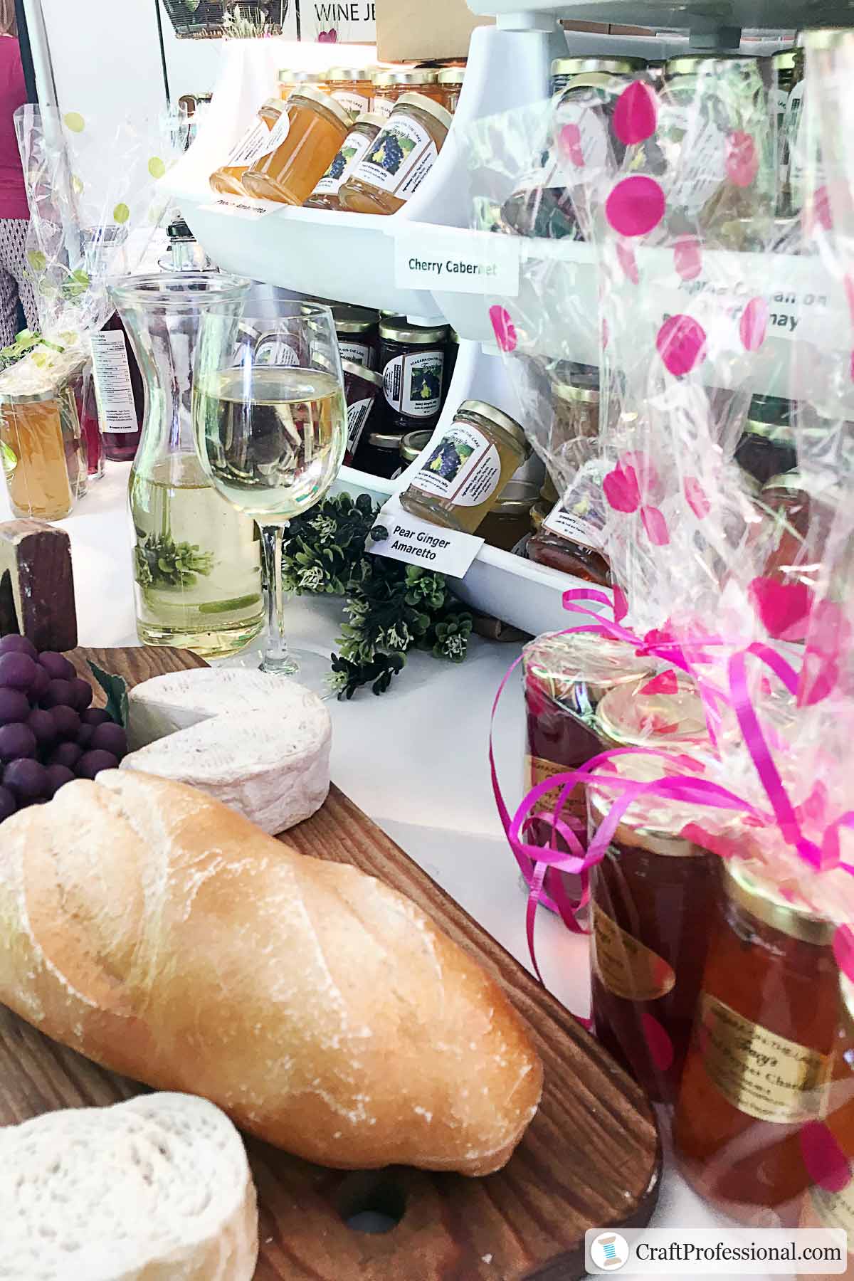
A lifestyle display shows how your products could be used in a real-life setting. It helps build desire to buy as shoppers imagine your products in their lives.
The photo above shows a booth that belongs to a food vendor who sells jams and jellies. Parts of the display are set up to look like a festive table ready to welcome guests at a party. This type of display takes shoppers' thoughts beyond tasty jams and jellies. They're also thinking about the good times they could have with friends sharing this delicious food.
Check out more craft show booth ideas featuring lifestyle merchandising.
7. Create a fitting room for your clothing pop up shop
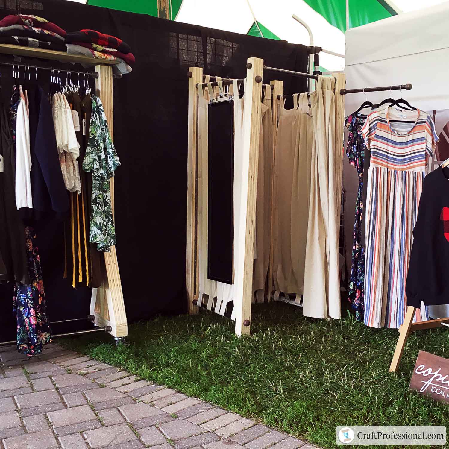
If you're designing a pop up clothing boutique, particularly if you're selling items that shoppers will want to try on before buying, make space for a fitting room in your booth.
The fitting room pictured above is made from wood posts and curtain rods. Fabric panels around all four sides provide privacy.
8. Avoid over-crowding your merchandise
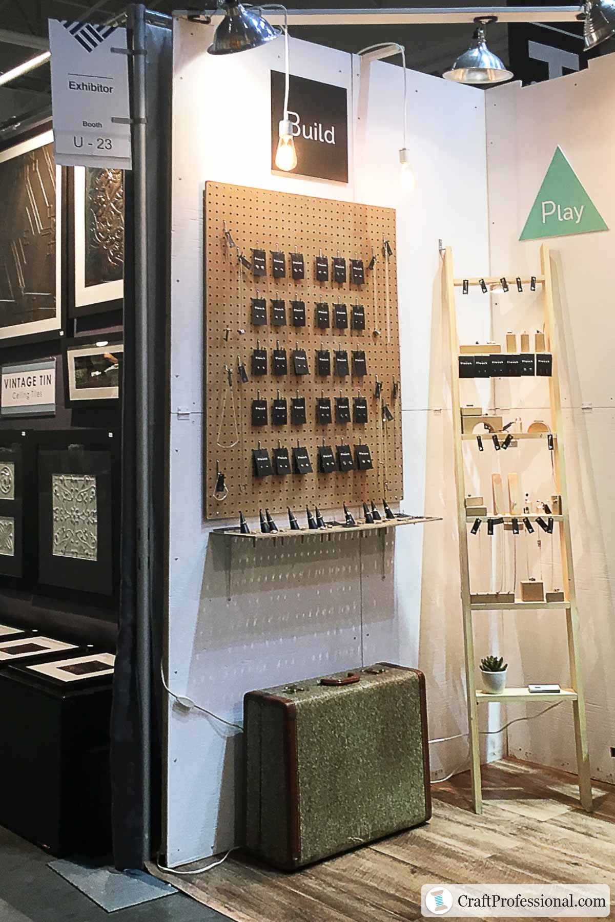
The pegboard pictured above could hold a lot more pairs of earrings. But the extra spacing between items makes the display attractive and easy to browse.
Remember, less is often more in merchandising. A crowded display signals lower value to customers and can drive down their expectations around prices. Keep displays uncluttered for a clean look and to raise the perceived value of your products.




New! Comments
Have your say about what you just read! Leave me a comment in the box below.