Jewelry Displays for Craft Fairs
There are so many creative options for jewelry displays at craft fairs. Really, you're only limited by your imagination - okay, and also your budget and your 10 x 10 booth size.
Here's a look at 11 booth photos to get you started. Some make great use of color to draw in customers, others use great product shots. Some use fabric texture to set the tone, while others use natural materials.
Take a look at what goes into making these great jewelry displays. Enjoy!
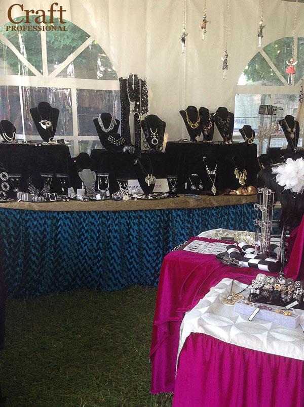
The jewel tones in the table coverings make a big first impression in this handmade jewelry booth.
I love craft booths that use color effectively. In this case, a big splash of color draws the eye from afar, but then lets the product shine when up close.
The sweet little angels hanging from the top of the tent (top right in the photo) add a fun, playful element and draw attention to a product you might otherwise miss.
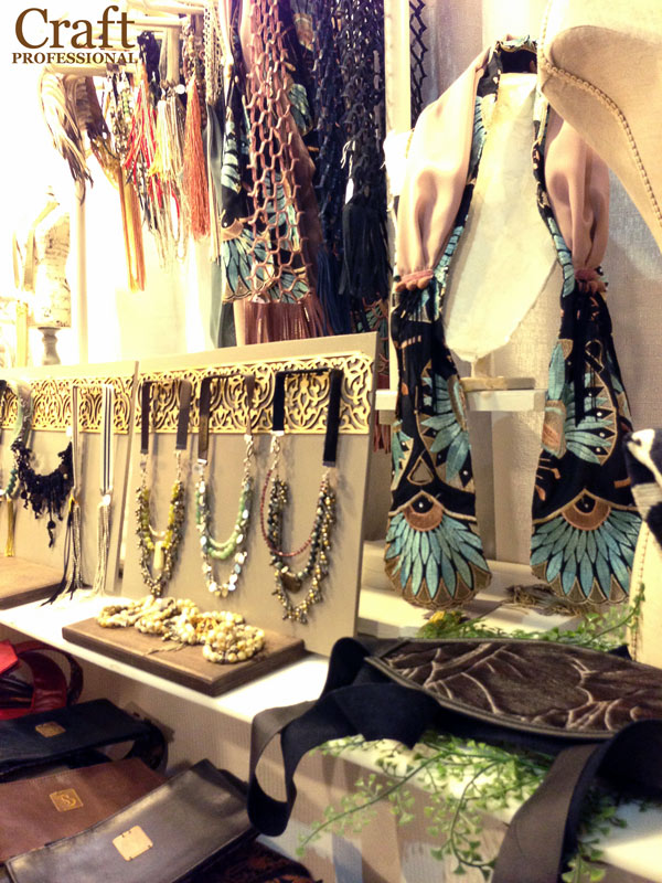
There's plenty of of eye-catching color and texture featured in this next display.
The ornate gold design across the top of the necklace display works to draw shoppers' attention. Since the design doesn't compete with the focal point of the necklaces, it works up close as well letting the statement necklaces come to the forefront.
The tall display stand that's visible on the right side of the photo adds height to the display and provides an effective spot to feature an impactful item.
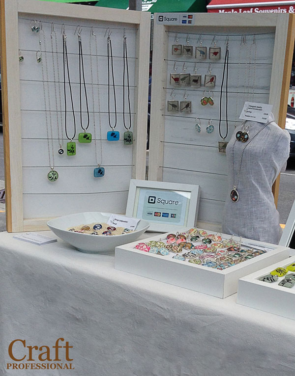
I love this all-white tabletop display at an outdoor farmers' market. It's both simple and effective.
Notice the weave of the fabric adds texture and interest while conveying a casual energy that's appropriate for a market and suitable for the fun, trendy jewelry that's featured in this booth.
Two white frames are joined with hinges and can be used to display pendants and earrings. I would bet the two frames can be closed together for easy transportation and storage.
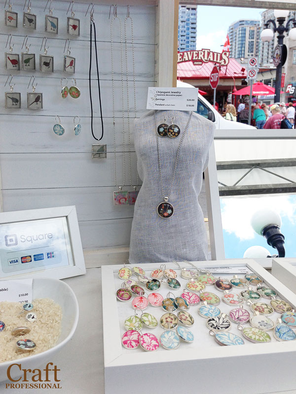
Here's the same jewelry display from a slightly different angle. A small tabletop mannequin is an excellent option for featuring a few impactful items.
Notice there are plenty of mirrors on the table so shoppers can check out how they look in their favorite necklaces.
White rice filling the bottom of a small bowl (shown bottom left) can be used as a simple and inexpensive base for displaying jewelry.
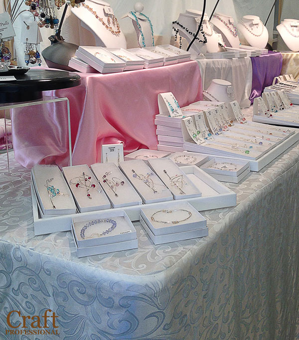
This booth, like the previous one, is also mostly white, but this booth is clearly designed to appeal to a different target customer. Although the color scheme is similar, this booth has a completely different feel than the one we just looked at.
The shiny, silky fabric used as a table cover is less casual and sets a more formal and elegant tone in this jewelry booth which matches with the style of the jewelry on display.
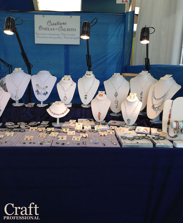
You can't tell from the photo, but the indigo table covering is a gorgeous velvet fabric. An indigo or midnight blue backdrop can provide a welcome and elegant change if you want to use a dark color in your jewelry booth, but you're not excited about using the black velvet you often see in jewelry displays.
Don't forget portable lighting for your jewelry display! It's a must.
Plenty of good lighting helps this booth shine.
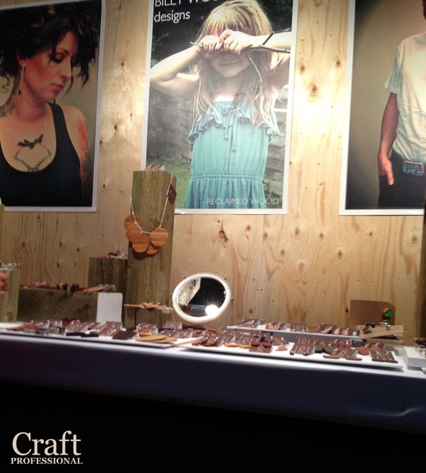
Beautiful product photography really sets the tone and tells a story in this next tabletop jewelry display. Large-scale signs in your booth help to draw attention from a distance. They are particularly helpful when you sell smaller items like jewelry.
Plain wood as a jewelry booth backdrop? It wouldn't work for everyone, but this jewelry designer's products are made from reclaimed wood. So the backdrop helps to tell the story of the product. The posters are essential, though. Without them, there would be a huge risk that the backdrop would appear overlooked.
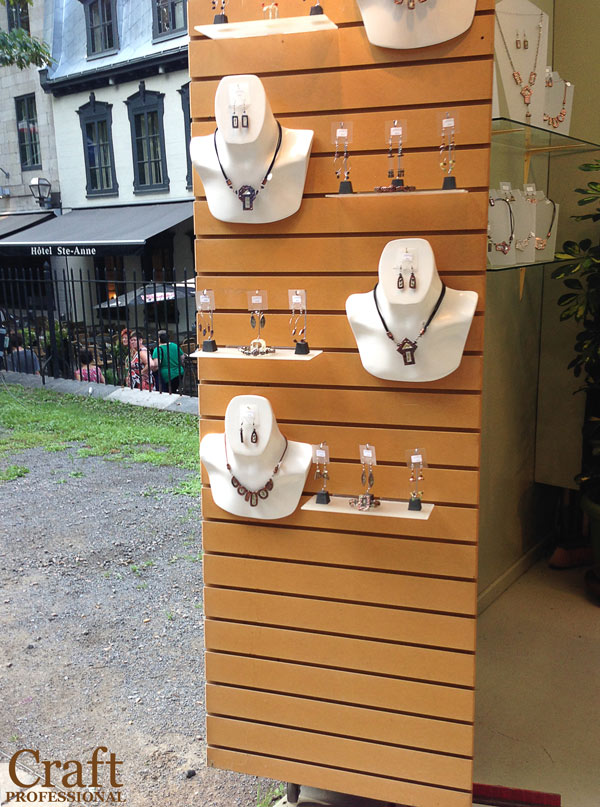
Slatwalls are used in this handmade jewelry kiosk in a busy tourist area of Quebec City. I've seen plenty of white slatwalls in other displays, but these wood-colored slatwalls add a little extra elegance.
Stalwalls provide a flexible display option, but they can be heavy, so be sure to check the weight of any product before you buy. In this display, the kiosks in the area are closed and locked up every evening, so the jewelry designer doesn't have to move the display frequently.
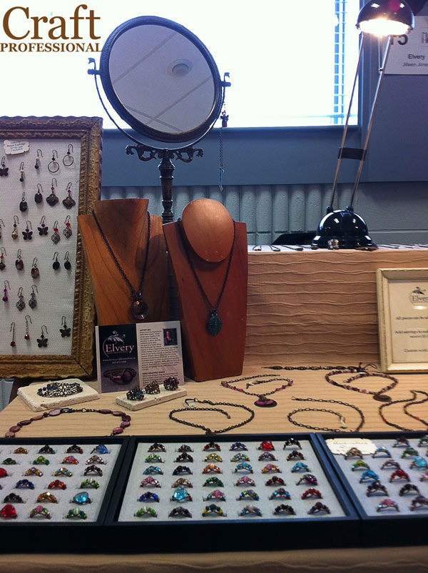
Here's a tabletop display that's tidy and pretty, but not overly fussy. There's good lighting in this booth (a common thread among effective jewelry displays).
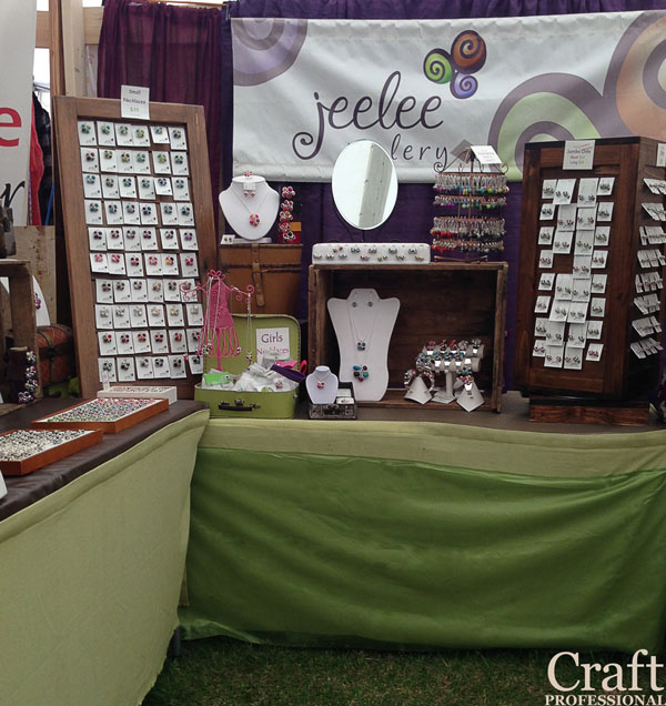
The natural colors in this booth are gorgeous. The green table coverings are eye-catching, but, combined with the beautiful wood jewelry display stands, the green seems to function as a neutral color.
Variation in height draws your eye around the display, but use of the same wood color with green and white accents ties everything together.
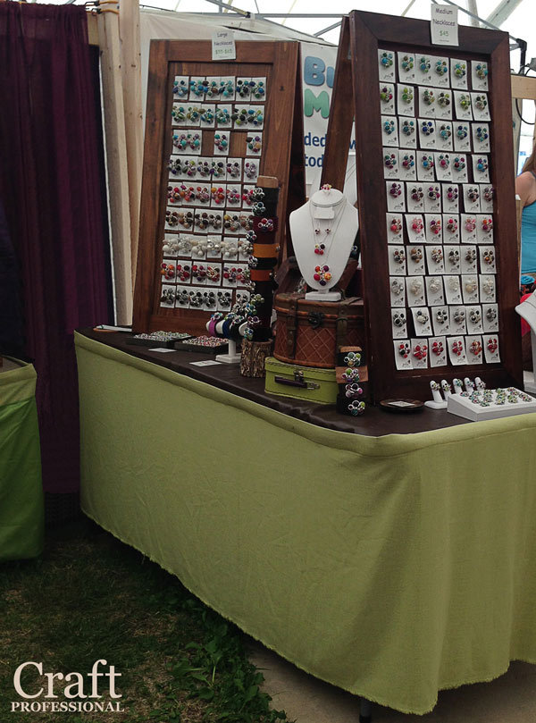
Here's the other corner of the same booth.
These DIY wooden jewelry display frames are genius. A large wood frame at the front provides plenty of space to display jewelry. There's a sturdy brace at the back, hinged at the top, which make a display that is beautiful, solid and completely portable.


New! Comments
Have your say about what you just read! Leave me a comment in the box below.