A Jewelry Display That Breaks the Rules
You learn plenty of rules about designing a jewelry display: avoid too much black, it's too dark; don't jam-pack your booth with product, it diminishes the perceived value of your work and makes it harder to command higher prices; keep the design simple to encourage customers to touch. For the most part, those rules will serve you well, but sometimes it's spectacular fun to break the rules.
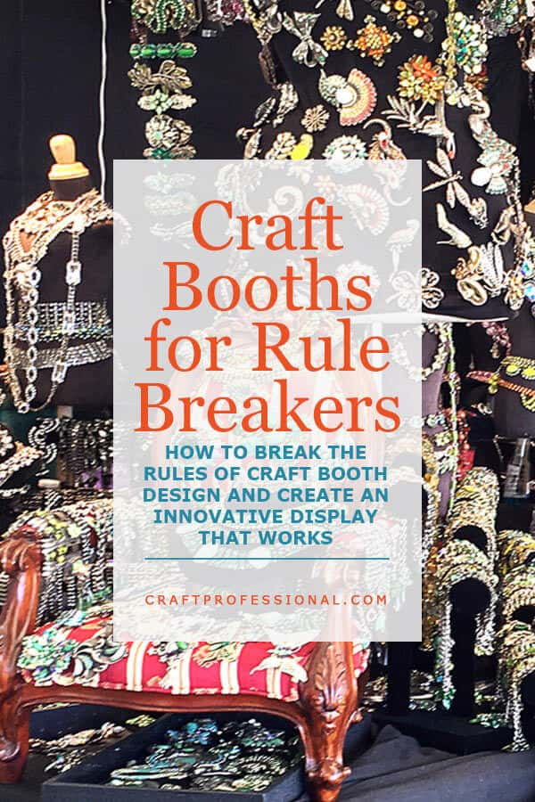
In the spirit of defying craft booth rules, here's a fascinating jewelry display. It doesn't just break the rules, it smashes them. It's dark, and it's jam-packed with a profusion of product - two things you're usually told to avoid at all costs when designing your booth. It breaks the rules to the extreme, and it works fabulously.
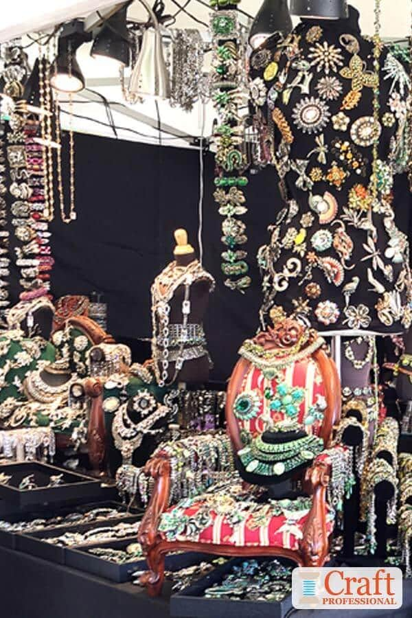
How do I know it works?
The designer is a long-time craft show veteran, and his booth is always filled with customers. I've been checking it out for years, and I don't believe I have ever seen it without at least a few customers fully engaged, trying on flashy jewels or chatting with the designer.
Certainly, the designer's personality helps. He is outgoing and friendly without being pushy. He makes shopping his handmade jewelry a fun event. But it's his spectacular booth that first draws people in from a distance.
The display stands out amid a sea of white, understated booths. It makes you want to explore this glittery vision before your eyes.
You don't have to break the rules to create a stand-out display, but if you are going to break the rules, do it with purpose like this designer does.
Break the Rules with Purpose
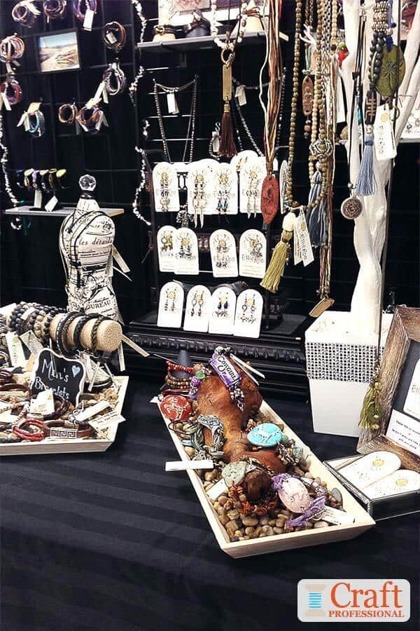
This display really is a marvellous fit with the product. The jewelry is meant to be showy, and maybe even a bit outlandish (I mean that in the absolute best way). You need some confidence to wear these statement pieces. That means the booth can also be confident in its flashy extravagance.
You know exactly what to expect in the designs even before you check out the jewelry up close.
If you tried to adopt this overflowing look to sell small, understated, refined pieces of fine jewelry, it just wouldn't work. The display would set up the wrong expectations for customers and create confusion.
If you're going to break the rules, be sure you have a specific reason for doing so. Don't over-fill your booth without a purpose just to be different. In this case, the designer has created a booth that perfectly accentuates the overall feel of the jewelry. There is a real method to the madness, and that's why the display is so clever and effective.
Go All the Way
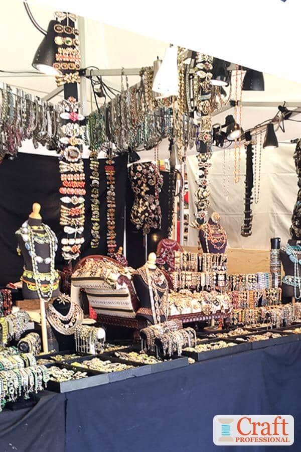
The designer has created a packed display that glitters from top to bottom. He went all-out. If he had been afraid of taking the look too far and held back, the booth wouldn't have the same effect. It could easily end up looking like an accidental design mistake instead of a brilliantly savvy design choice.
The jewelry sells for substantial prices. The profusion of products draws customers in, and because it's done with real purpose, it doesn't diminish the perceived value of the accessories.
Although craft professionals often avoid creating a very dark overall booth, the black background in this display works perfectly with the opulent arrangement of glittery jewelry. Black is the absolute best color to set a foundation for and contrast with these sparkly jewels. If this designer had avoided black because he was afraid to take his innovative booth design too far, he would have diminished the effect of the display.
If you're going to break a rule, fully commit. Break it like you mean it, and do it with purpose!
But Don't Let Your Rule Breaking Keep You Out of Better Shows
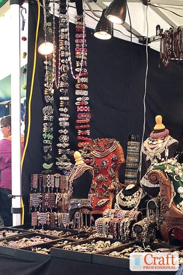
Take a look at the top of the booth. Notice the tent canopy is white.
In past years, this booth has featured a black canopy. Although I didn't ask the designer why he switched to white, I wonder if, perhaps, he has made the change so he won't miss out on some of the better craft shows. Some shows require vendors to use a white tent, so a black canopy - even one that's used to excellent effect by an established designer - could cause you to miss out on some important shows.
Also, notice he hasn't broken all of the rules of good booth design, just the ones that serve his purpose.
He has met all of the organizers' requirements for this show. The booth is full of fabulous lighting that makes the accessories sparkle. And all of the items can be easily picked up and tried on. The display is full, but it's not too fussy. It encourages customers to play and explore the booth to find their favorite treasure!
Moving Forward
Pablo Picasso famously said, "Learn the rules like a pro, so you can break them like an artist."
In part, that means you need to understand what the rules are, why they exist, and what function they serve before you start to break them. When you understand the purpose of rules, you can break them effectively and strategically with a purpose in mind to create a specific vision that works.
I'm pretty sure Picasso didn't have craft displays in mind when he said it. ;) However, the sentiment still applies equally well. If you want to break the rules, go for it, but do it with a clear purpose and understanding of what you want to achieve when you break the rules of craft booth design.


New! Comments
Have your say about what you just read! Leave me a comment in the box below.