Craft Show Display Booth Planning
Analyse these two craft show display photos for lessons you can apply when you design your own booth.
I'm always on the lookout for great booth ideas.
Of course reading tips on how to set up a great booth is helpful, but when you can see those principles put into practice in real booths, it can be much easier to imagine how you could apply the same principles when you design your own craft show display.
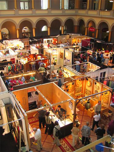
Below you'll find two photos taken at a major show, plus a couple of extra photos to help illustrate some points. There are some excellent craft show displays shown in each photo.
The photos are taken at a distance, which I think is helpful.
Although you can't see the details of the displays, you can get a really good sense of the overall impression that the booths create. And that's what we're talking about here - the booths on an overall, large scale, not the displays within the booths.
Here's Why I Think These Craft Show Displays Work
1. Lots of great lighting
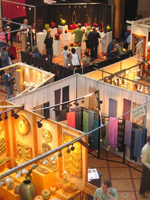
Count the number of lights that are in a single booth and notice how the lighting enhances and draws your eyes toward the items in each craft show display.
There aren't just two or three lights in each booth; there are plenty of lights throughout each booth, and some of the lights are used effectively to highlight the major pieces in the craft show booth.
2. Open feeling
For the most part, the entries into the booths are wide open and inviting. There are no little bits of furniture or display racks blocking the entrances, and there is plenty of room to move around in the booths.
3. Use of colors that enhance the products
I love the overhead views of these booths because it really clearly shows how color is used in individual booths to complement the items being sold.
Specifically, compare the pottery booth and the scarf booth in the top picture. The warm, neutral colors of the pottery booth, create an atmosphere of old world opulence. The booth right next door uses white walls as a backdrop to colorful scarves to create a more clean feel.
4. Unified product line
In addition to creating lovely individual pieces, these artists have also considered how their products as a whole work together.
This concept is very clear in the craft show display with the fruit sculptures (at the back of the photo on the top). The artist has presented a unified style.
Because he or she is not trying to be all things to all people, the work within the booth creates a compelling statement that won't work for everyone, but it will draw in the right customers.
5. Displays that fade into the background

These trade show booth displays are wonderful, in part, because they are not the first thing you notice when you look at one of the booths.
The products are the first things you notice when you look at each booth. I would never walk up to any of these artists and say, "You have a wonderful display." I'd be too busy focusing on the great items they have to sell.
6. Items displayed at varied heights
The booths with the scarves, the fruit sculpture booth, and the pottery booth each have a very different feel, but they all have one thing in common. Items are displayed at a variety of heights in each booth.
Varying the heights of your displays helps to draw the eye around your booth so customers see all of the items in your booth.
7. No clutter
Although these artists have made full use of the space available, their booths are not cluttered.

If you provide too many options, people will often choose nothing. Similarly, if you provide too much to look at, people will see nothing.
There's a fine balance between not enough product and clutter. The designers of these booths have found that balance.
8. Raised counters and display stands
Items are, for the most part, displayed in the prime area between waist height and eye level. There's no need to bend over to see each artist's treasures.
This concept is used in retail sales all the time. The next time you go to a grocery store, notice which items are placed at eye level, and compare that with the items above and below. The items at eye level are the ones the store most wants to sell, usually because they make the most profit on those items.
9. Busy and happy looking people
There are no artists slumped in a chair looking bored. It is important to keep yourself busy in your booth because a bored or sad looking artist will make potential customers avoid your booth.
10. Big first impressions
Many of the booths make a big first impression. They can be seen from a distance, and they provide an overall sense of the artist's sense of style before you even enter the booth.
11. High quality displays
While this is easier to assess from close up, there do not appear to be any cheap looking displays. Low quality displays can really take away from the perceived value of your work.
12. Displays that encourage customers to touch
Most items are displayed within easy reach. Nothing is so elaborately displayed that people will avoid picking things up because they "don't want to ruin the display."
13. Professionalism
Although the displays must be portable, there's a real air of permanence and professionalism to them. Any of the booths could easily be a part of a well-designed store.
How to Apply These Lessons To Your Own Craft Show Display
These booth photos illustrate the most fundamental principals for designing a great booth.
To assess whether your own booth uses the same principals effectively, take a photo of your entire booth the way you normally set it up. It is absolutely amazing how well a photo can help you to see things that you may not see when you're simply standing in front of your booth.
Do you have photos of your own booth? Why don't you take a look at your booth photos, compare your booth against the list of 13 criteria for great booths on this page, and see what works and what could be improved in your own craft show display?
Readers' Craft Show Display Ideas and Tips
Click below to see what readers have said about creating their craft show displays...
Specific Craft Booth Display Ideas
Looking for some craft booth ideas? Read on to find out what readers have used to create their own creative, effective, and inexpensive displays.
Tree …
General Craft Display Tips and Concepts
Here are several general tips and concepts submitted by readers to help you plan and set up an effective craft display.
Retail Craft Merchandising …


New! Comments
Have your say about what you just read! Leave me a comment in the box below.