Does Your Craft Fair Display Match Your Products?
Does the ambiance of your craft fair display match your products? It should!
When you start to develop your booth design, it's important to think of your company image and your products as a whole and communicate that in your display.
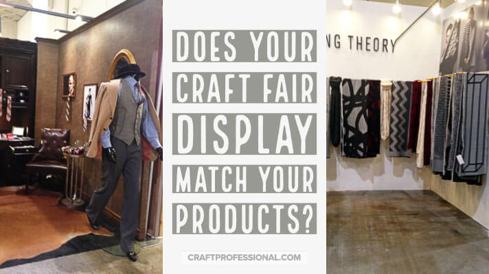
A booth that doesn't create a cohesive feel that underscores the image inherent in your products is a lost opportunity to draw customers in. And a booth design that actively works against your product image and customer expectations can cause you to lose sales.
Your booth often creates the first impression people have of your work. This is particularly true if you sell smaller items that aren't easily viewed from a distance. Your booth setup presents a huge opportunity to communicate to customers. What do you want to say to them?
Some Examples Of Craft Fair Displays That Make the Right First Impression
Pictures speak louder than words. So, to illustrate this point, here are several photos to show you how a great match between display and product make an impact. I've grouped them based on the type of item sold (i.e. soaps, clothing, tableware, etc.) to make it easy to see how items in the same category can have a very different feel and, therefore, require very different displays.
Soap Displays
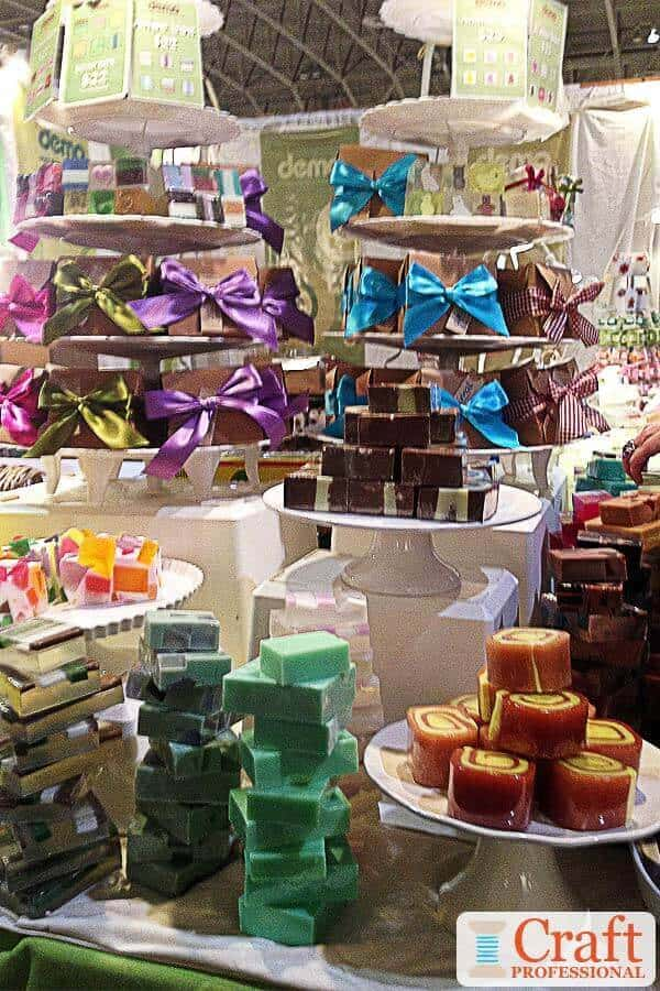
The exuberant, colorful soaps pictured here are bright and fun.
The display is a riot of colors with the soaps tied up in brightly colored bows and displayed on cake stands. It makes you think of parties, and the soaps look treats that are good enough to eat.
The look completely works with the fun, bright colored soaps.
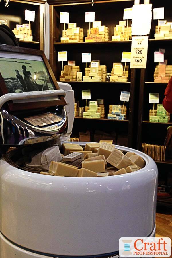
Compare that booth to the more muted colored soaps in this next picture. The look of the soaps says natural, back to basics, and possibly organic.
This craft fair display is simple with neutral colors, and the vintage washing machine is brilliant. It's related to the product, it catches attention but then draws you in to inspect the product - the soap that's in the washing machine.
For anyone old enough to recognize what it is (I'm 40-something, and I remember my grandmother doing laundry in a machine like this one) it instantly says vintage, homey, and made with care just like grandma would have made.
Note: This booth is at a huge, indoor show. I wouldn't want to drag a vintage washing machine around to a bunch of smaller shows, but it makes sense here!
Both booths are great, and both products are great (I have purchased soap from both of these companies and love them both), but if they traded booths, and the bright soaps went in the vintage washing machine, and the natural, neutral soaps got tied up with bright bows and went on the cake plates, neither booth would be particularly effective.
They wouldn't communicate a cohesive message, and they wouldn't be as enticing to customers.
Clothing and Accessories Displays

One quick glance, and you immediately know this next booth is full of whimsical dress-up clothing for little girls.
The eye catching product, which is very easy to see on the outside corner of the booth, combined with the vivd pink curtains tells the story in an instant.
When you walk by this booth, you'll instantly know it's the place to look if you want a cute gift for a little girl.
Although the clothing makes a strong statement on its own, if the curtains had been any other colour, the booth probably wouldn't have communicated "whimsical little girl items" quite as clearly.
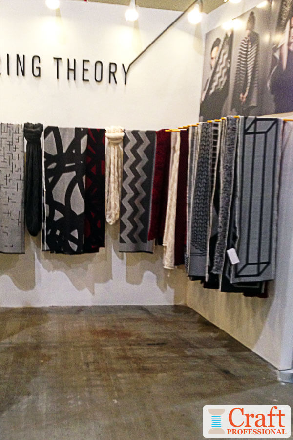
This display in the next photo is the height of luxury. The elegant simplicity of this booth immediately communicates a high-end feel and will help this artisan command higher prices for each item.
Notice the booth isn't jam-packed with product, which helps to highlight the specialness of each shawl. The textile designers might have many many more shawls packed away out of sight, but by displaying just a few in an open space, they create an air of luxury.

Next up is a clothing booth in a completely different vein. It's fun and whimsical.
These items are trendy impulse purchases, not investment pieces, and the display communicates that. Compared with the previous photo, there are more pieces on display, and they are more casually arranged.
The blackboard with pricing information carries through the fun, relaxed feel.
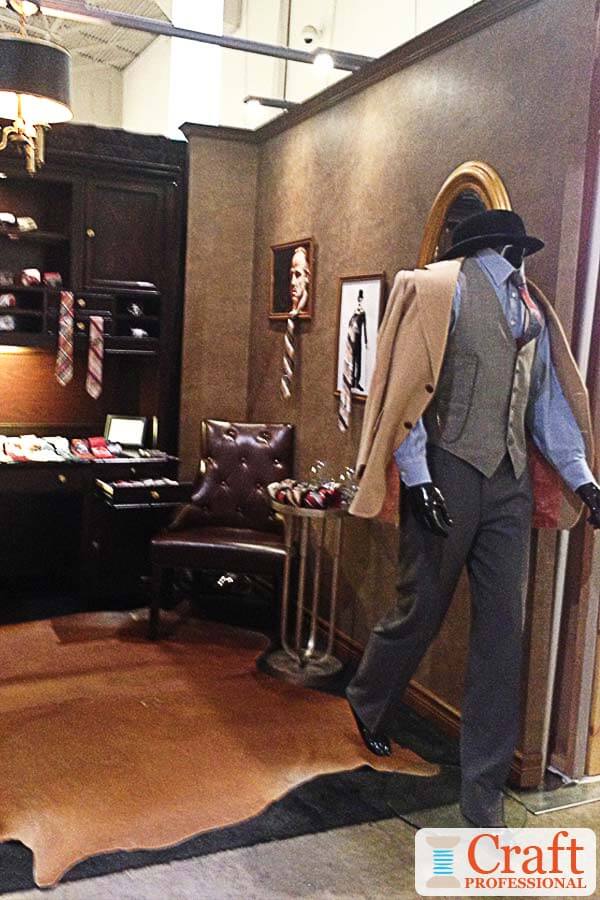
Next we have an artisan who sells men's ties. This booth completely stood out from all of the others at the show because of the pure masculinity of this craft fair display. There's no question who these items are for.
Although it also has a feeling of luxury (like the scarf and shawl booth), it still carries a different vibe than the handmade shawl booth, which is more modern.
All four booths sell some type of clothing or accessories, but the message that's communicated to customers is completely different in all four cases.
HAndmade Tableware Displays
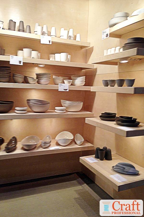
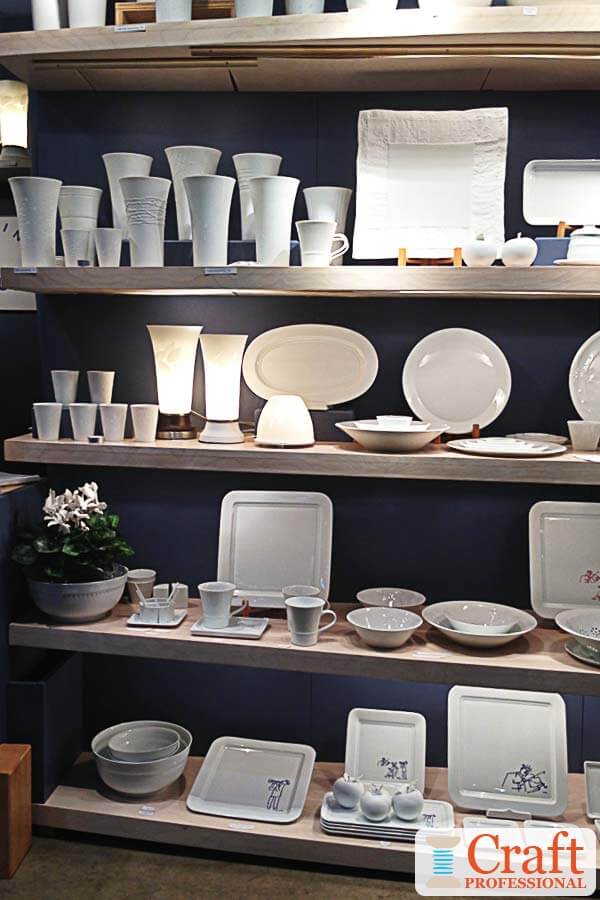
The next two craft fair display pictures show displays with modern style dish ware. Although the looks are different, there are a lot of similarities in the booths including simple floating shelves (i.e. no fancy shelf brackets to disturb the minimal look), good lighting, and no extra adornment.
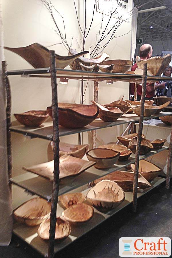
The third photo also shows tableware, but this time it's wooden with a very natural vibe. Although they are also displayed on shelves, the wood poles supporting the shelves tie in with the look of the bowls.
You might have noticed that the modern tableware booths pictured above also have wood shelves, but the sleek, smooth finished wood creates a completely different feel compared to the unfinished wood in the more natural booth.
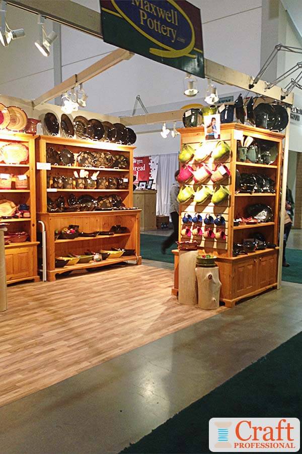
The fourth tableware example shows items that are more traditional in style. These pieces are displayed on the type of warm wood cabinets you might expect to find in a modern farmhouse.
It helps customers imagine the pieces displayed in their own homes.
The sleek lines of the floating shelves that work so well in the other displays pictured above simply wouldn't fit as well with these items.
Paintings on Display
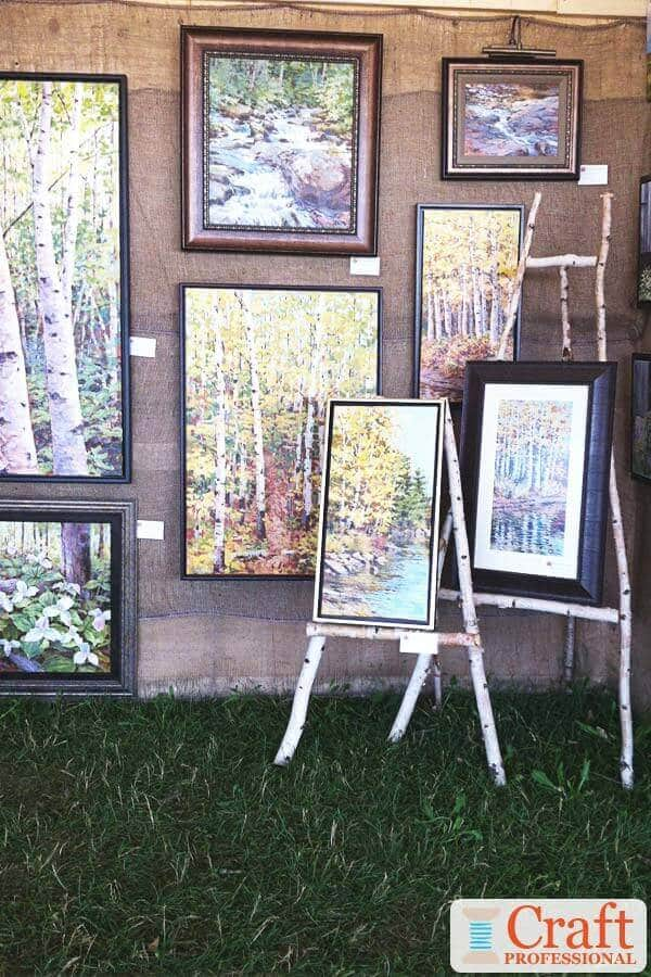
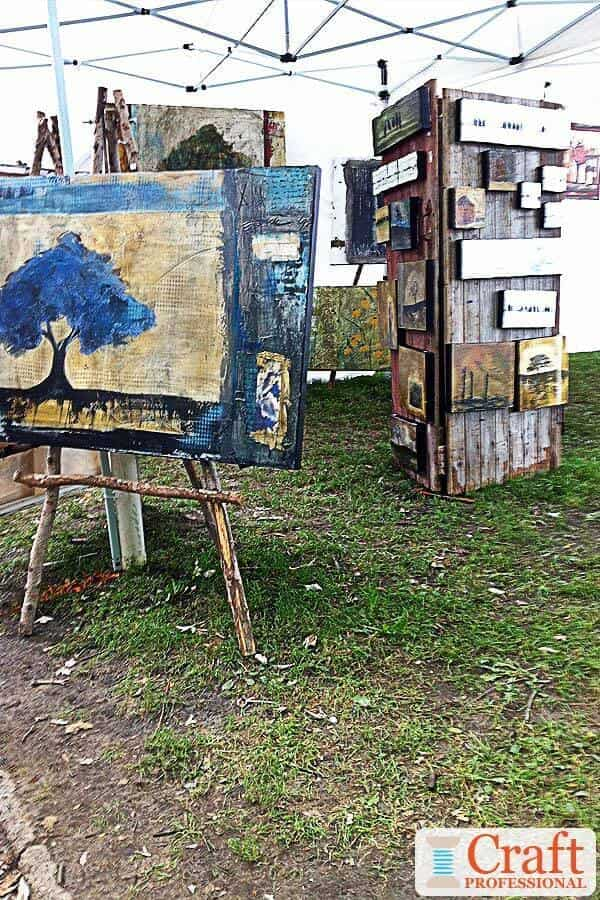
I love the twist on the standard easel in both of these art booths. Each of them show fairly natural, rustic paintings of trees, so instead of the standard easel, these artists have used easels made from wood that could very well have come from branches of the trees in their paintings.
This rustic type of easel would be completely out of place in another style of painting, but it's a clever match for the work of these two artists.
Garden Decor DIsplayed at Craft Shows
The next two booths have a similar feel. Both display whimsical garden decor, and their booths work to bring the idea of the outdoors into a craft booth.
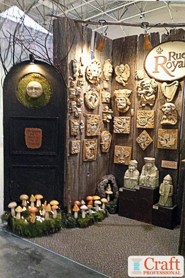
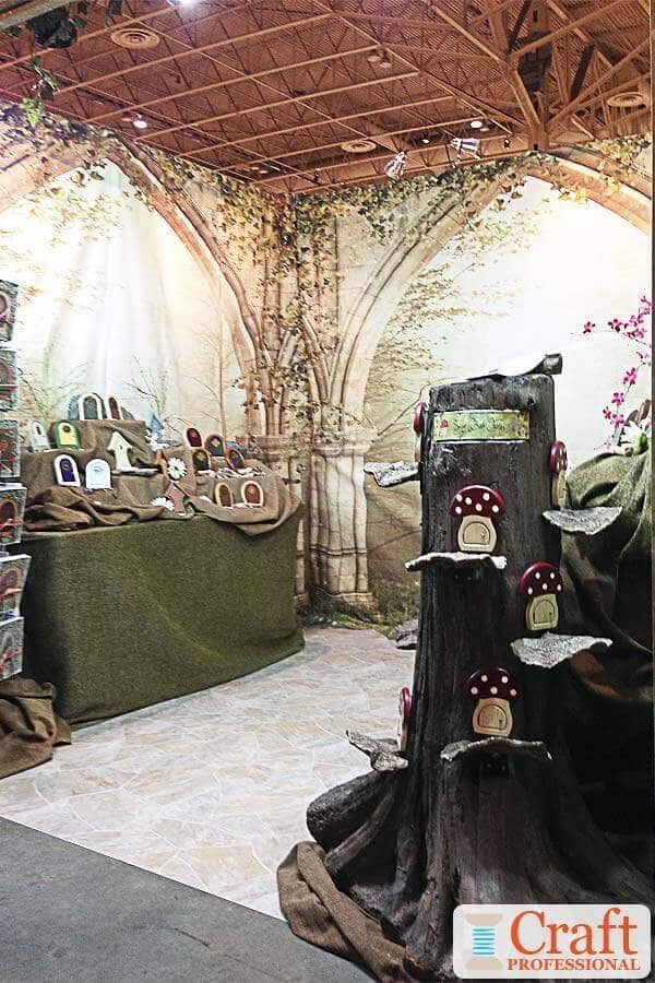
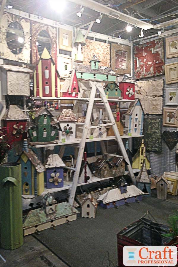
This third booth of outdoor garden decor has a slightly different feel.
It isn't evocative of the outdoors, but instead the rustic feel of the birdhouses is carried through with the display, particularly the old wooden ladder used as a shelf.


New! Comments
Have your say about what you just read! Leave me a comment in the box below.