Craft Booth Color
Color, planned and used strategically, can have a great impact on your craft booth.
It's one of the best tools you have to draw attention to your booth at a distance without becoming a distraction as customers get close up to take a closer look at your work. Well placed, well chosen color can work wonders in a display.
Here's a look at 6 craft booths that use color in different ways to achieve great results.
Creative Craft Booth Color
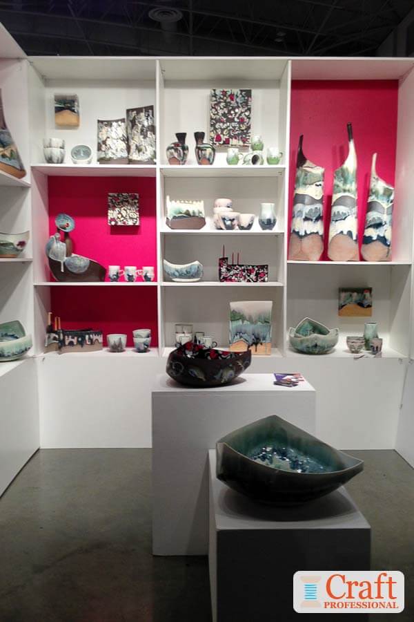
I am completely smitten with this display. It has a restrained simplicity. It is obviously well thought out, and the simplicity allows the splashes of pink to really do their job and stand out and draw attention.
The foundation of the booth is a simple, well lit white space. But what elevates this booth from good to spectacular are the bursts of pink. They draw your eye in, and because they are different heights, they cause your eye to move throughout the booth.
Also, notice that the pink contrasts beautifully with the green-blues in this artists' sculptures and is echoed in little bits of pink accents in the artists' work.
This pink and white display, on first glance, is deceptively simple. But spectacular use of color like this only happens with smart planning.
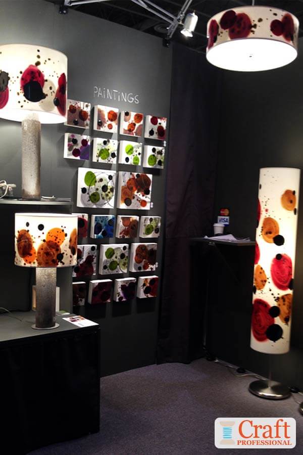
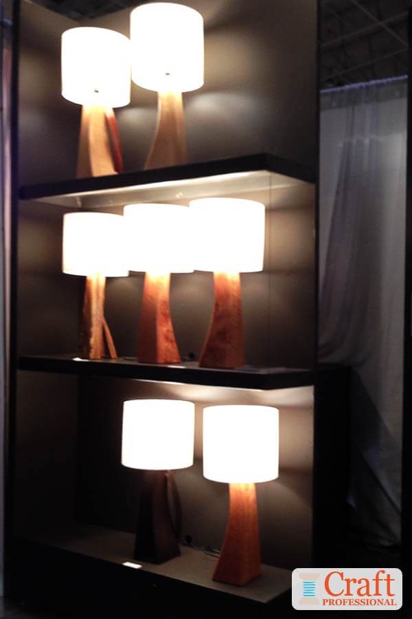
Here's another spectacular booth that uses color to show products at their best advantage. Normally, you'd tend to avoid an all-black booth. But the color in this display shows these handmade lamps at their absolute best. The bright white shades contrast beautifully against the black backdrop. And the color adds a feeling of luxury to the products.
Try to imagine these lights displayed against a more traditional white backdrop. They just wouldn't have the same impact. Dark color makes this booth sing.
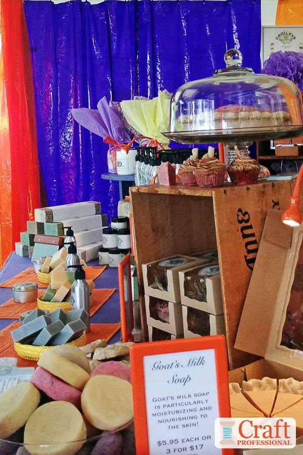
The vivid contrasting colors in this booth draw your eye from a distance. Approaching this booth, you just have to stop and see what treasures are under the brilliant orange and purple canopy.
The beautiful aspect of using bold strong color is that, although it catches your eye and draws you in, once you get close enough to the booth to check out the products, the color disappears into the background. Strong color without pattern really is an excellent way to draw attention to your display without taking attention away from your products.
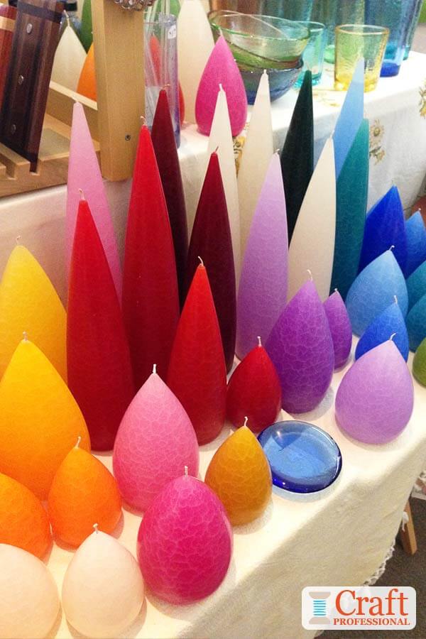
Here's an example of effective color, combined with size, used on a smaller scale. Arranging these handmade candles in a rainbow and also according to height, provides some order in a multi-colored display. If these candles weren't organized by color and height, the display would be much less effective. Color blocking (grouping your products by color) can create a similar effect.
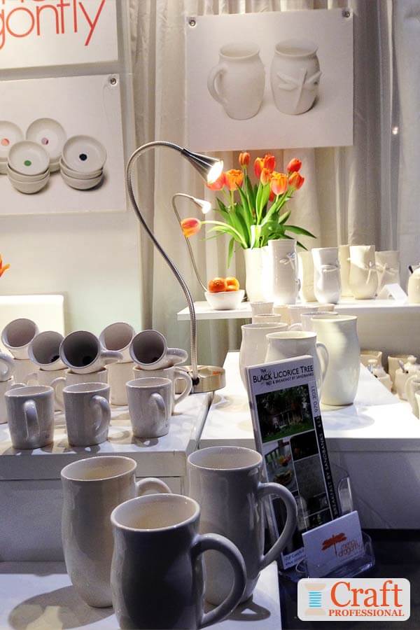
This booth shows you can add a low-cost, low-commitment splash of color to your booth. The orange in the tulips and tangerines are the perfect complement to the white tableware. Plus, they add a homey feel to the display, helping customers to imagine this artist's products in their own homes.
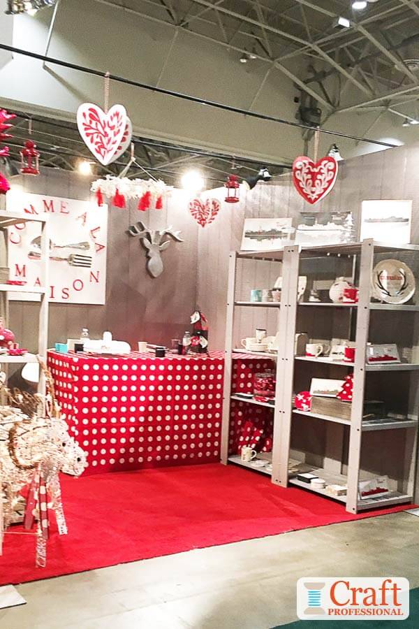
Check out the Nordic vibe in this red and gray display. It's unique, steering away from more traditional craft booth color schemes, so it stands out. Even though you can't see the products at this distance, the color scheme and overall feel of the booth communicates a style and sets that expectation for products with a Nordic charm.
These photos make it clear that, with a little thought, some well-chosen, well placed color can take your booth to the next level. Perhaps you need nothing more than a can of paint and a paint brush to make your own booth spectacular.


New! Comments
Have your say about what you just read! Leave me a comment in the box below.